
Choose the format that gives your product room to speak
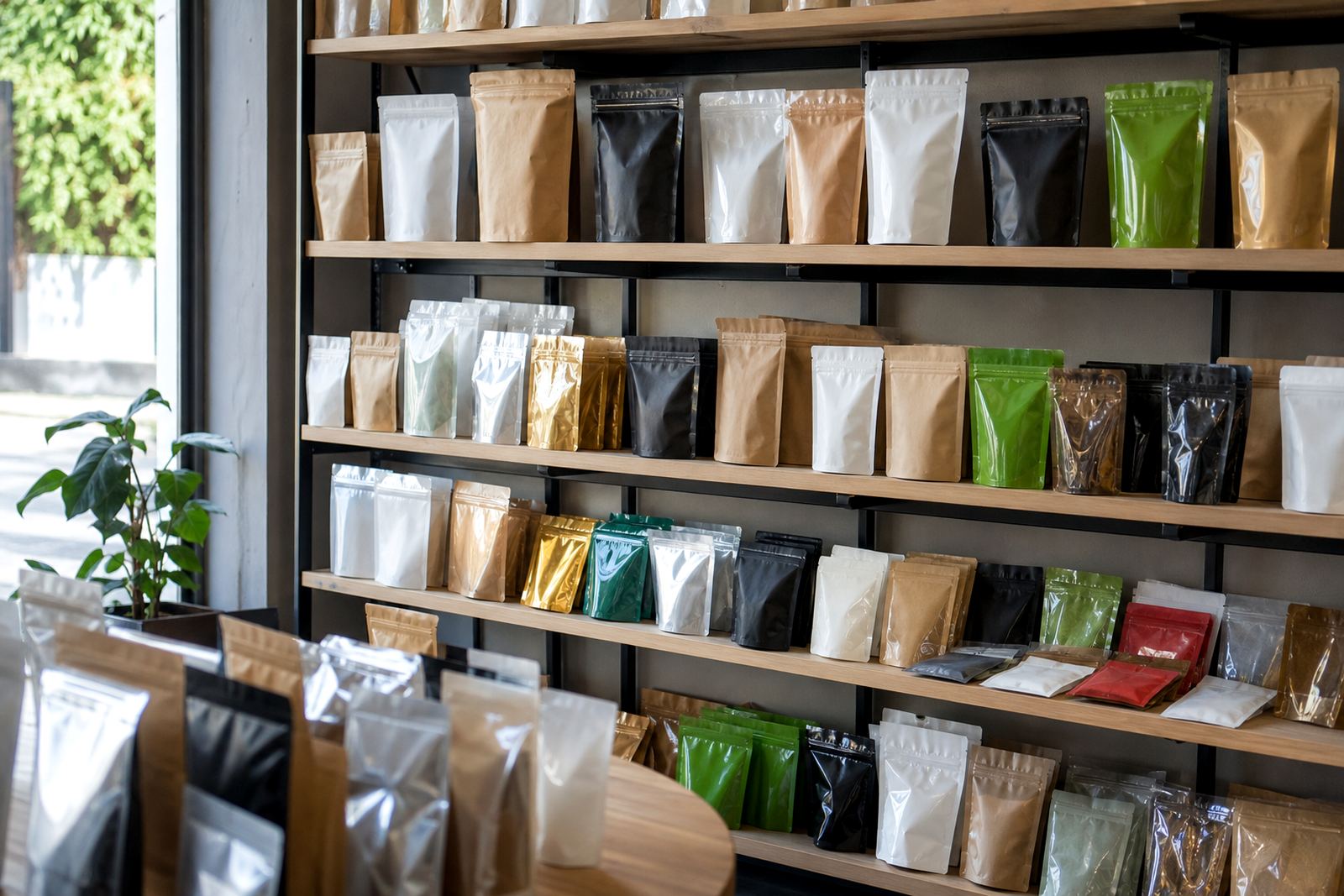
The first shelf decision is often the format itself. A stand-up pouch gives a product more front-facing area than a small sachet, while a wrap can be better when the item needs to sit flat or move quickly through packing lines. The right choice depends on what the shopper needs to see in two or three seconds.
For smaller packs, every millimetre matters. A neat panel layout, a clear seal area and a label area that is not cluttered can make a real difference. If the front panel is overloaded with claims, icons and too much text, the pack becomes hard to read at a distance.
- Use the largest usable panel for the main product name.
- Keep key details in one place, not spread across all sides.
- Leave enough space around important text so it does not feel cramped.
- Make sure the format suits the fill weight and product shape.
Use colour contrast that still prints cleanly
Colour is one of the fastest ways to create shelf presence. Strong contrast helps a pack stand out, but only if the colours reproduce properly on the chosen material. On flexible packaging, a tone that looks bright on screen can shift once it is printed on film or paper laminate.
That is why colour matching is worth time early in the job. A simple background with one strong accent colour often works better than trying to use too many shades. In humid coastal areas like Durban and Ballito, you also want to think about how the pack will look after handling, transport and time on shelf. Gloss, matt and textured finishes all affect the final look.
- Pick one main colour story and keep to it across the range.
- Test contrast between text and background for easy reading.
- Allow for small shifts in printed colour on different materials.
- Choose finishes that suit the product and the retail setting.
Make the front panel readable from a proper shelf distance
Many packs lose impact because the words are too small or the layout is too busy. A shopper standing in a a leading make aisle in Pietermaritzburg or a wholesaler in Johannesburg is not going to study the pack closely. They will scan for the product name, the flavour or variant and a quick reason to choose it.
Good artwork prep helps here. The front panel should guide the eye in a clear order. Start with the brand or product name, then the key variant, then a short supporting line if needed. If the pack needs a barcode, legal text or batch space, keep that away from the main selling area. It sounds basic, but it is often where the design goes wrong.
- Use type sizes that can be read from arm’s length.
- Keep the top third of the pack uncluttered where possible.
- Place technical and regulatory details where they do not fight the main message.
- Use one clear callout rather than three competing ones.
Shape, seals and finishes can help the pack stand up on shelf
A pack does not only sell through print. The way it sits on the shelf matters just as much. A pouch that stands properly and keeps its shape is easier to notice than one that slumps forward. Even the seal width, the gusset and the top closure all affect how the pack presents itself once it is filled.
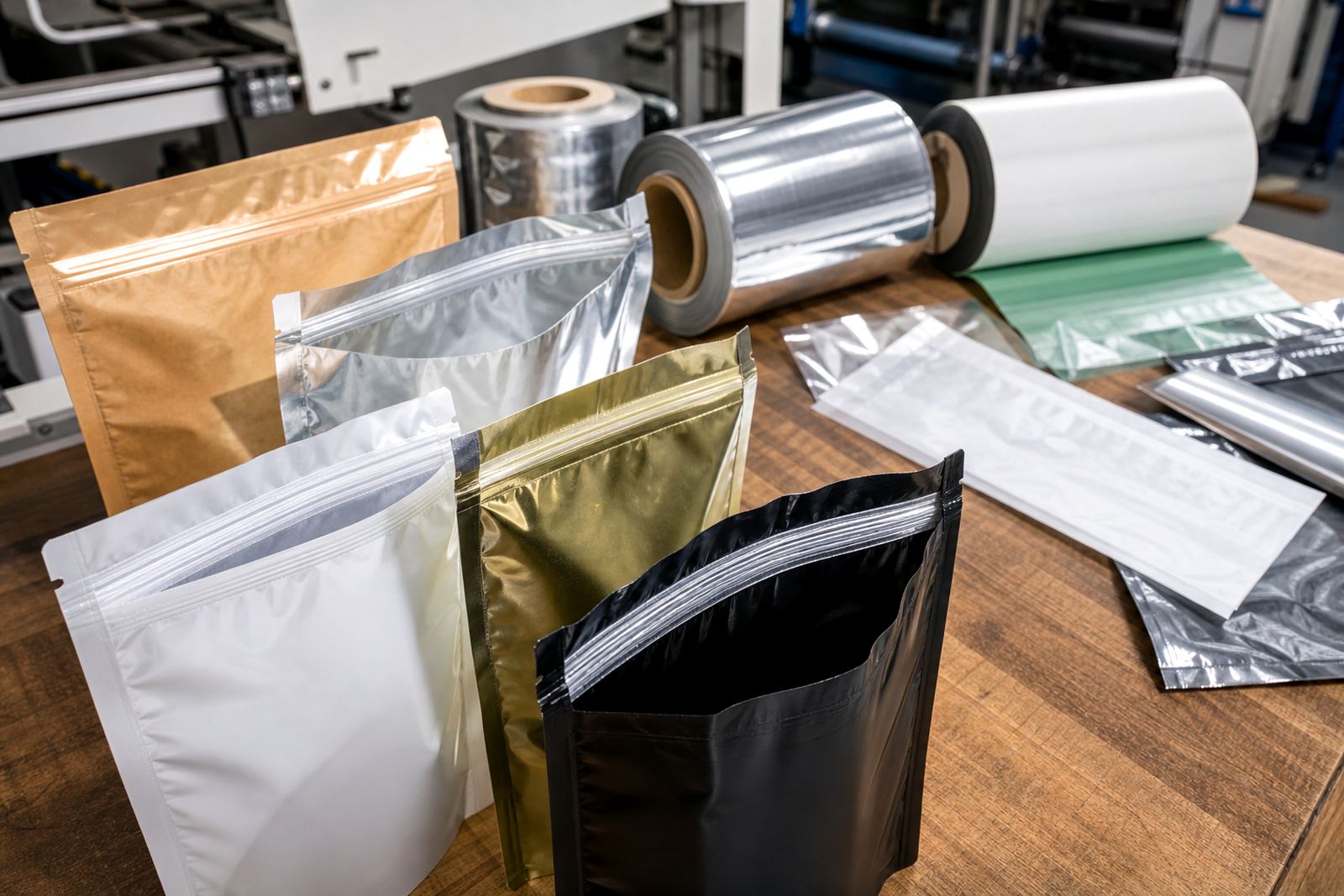
Finishes matter too. A matte surface can give a quieter, cleaner look, while a glossier surface tends to catch more light. Neither is automatically better. The choice depends on the product, the market and how the pack should be seen under shop lighting. In lower light stores or during load-shedding when backup power changes the lighting conditions, bold contrast often helps more than fine detail.
- Choose a format that stands neatly without support where possible.
- Check how the pack looks from the side, not only from the front.
- Use finish and surface choice to support the message.
- Keep seals and edges tidy so the pack looks cared for.
Repeat orders need the same look every time
Shelf impact is lost quickly if the next print run looks different from the last one. A brand that changes colour, layout or panel position from batch to batch can confuse customers and make the shelf look untidy. This is especially true for products with multiple variants on the same rack.
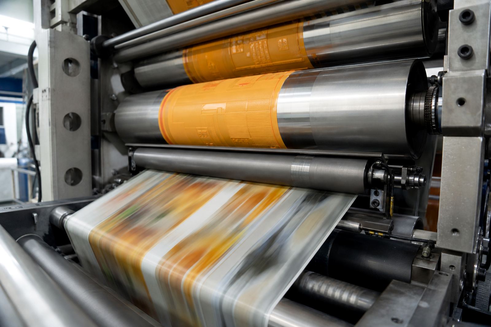
Repeat production should be handled with proper proofing, colour matching and records of the approved artwork. That way, a pack ordered again for Cape Town or Bloemfontein will still match the earlier supply. For local brands, consistency builds trust. It also reduces waste because the team is not trying to fix avoidable differences after the job is already underway.
- Keep approved artwork files organised and current.
- Use the same colour references for repeat work.
- Check the first sample against the previous approved pack.
- Confirm any wording changes before production starts.
A local example from Pinetown to the wider market
Consider a small snack or dry goods brand in Pinetown that sells through local independents and sends stock to Durban, Pretoria and Cape Town. The product may start as a simple sachet, then move to a stand-up pouch once demand grows. The design should help the product work on a crowded shelf and still fit the practical side of packing, transport and storage.
In that kind of case, the strongest approach is often not the loudest one. A bold main colour, a clean product name, a clear variant marker and a tidy seal layout can do more than a busy design with too many effects. If the product is shipped across South Africa, the pack also needs to stay readable after handling, pallet movement and time in mixed store conditions. That is where proper packaging consultation, dispatch coordination and material selection pay off.
- Keep the core design steady across all pack sizes.
- Allow the format to suit both shelf display and transport.
- Use artwork that holds up across regional deliveries.
- Plan for store conditions as well as print conditions.