
What gloss and matte finishes change on a flexo pack
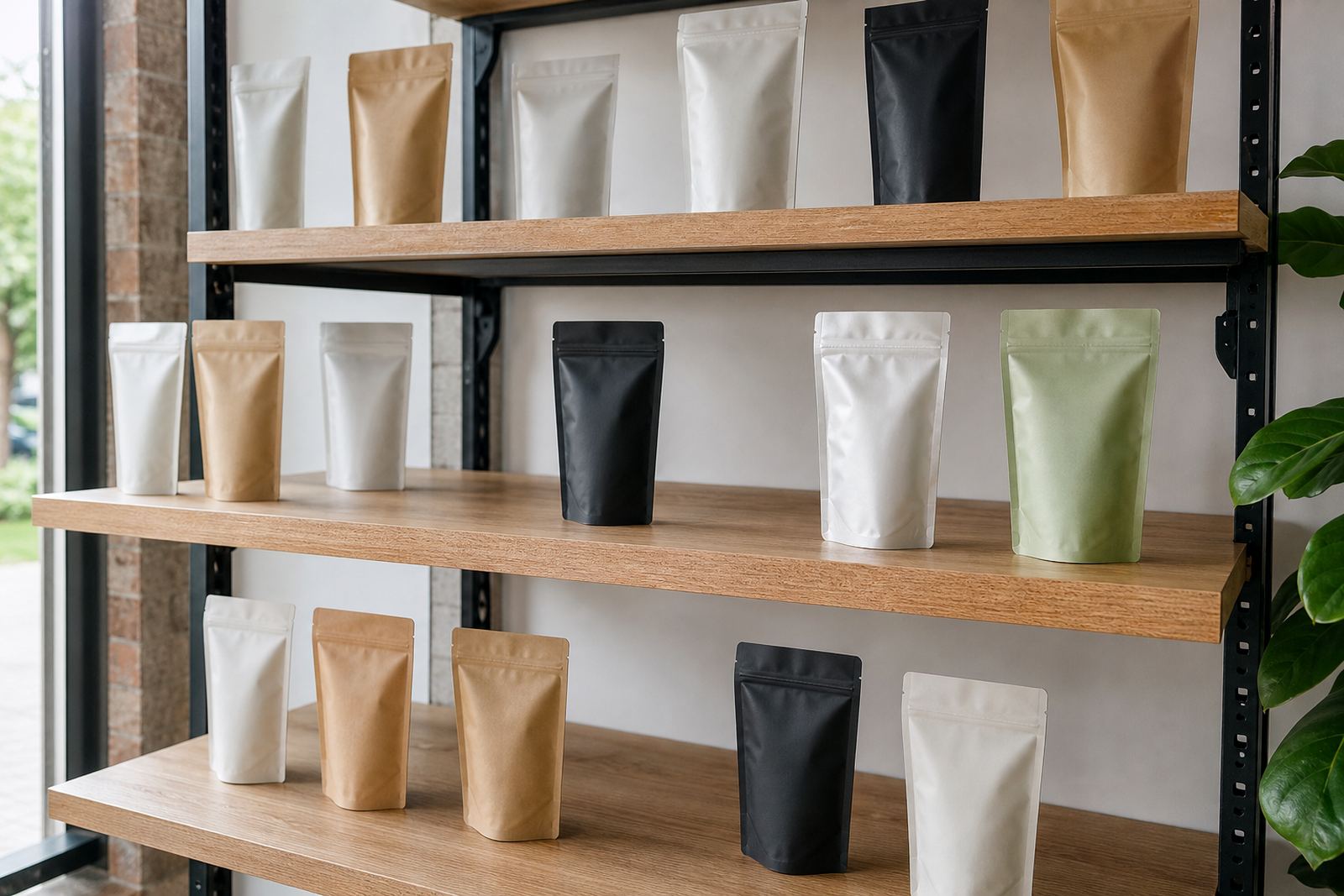
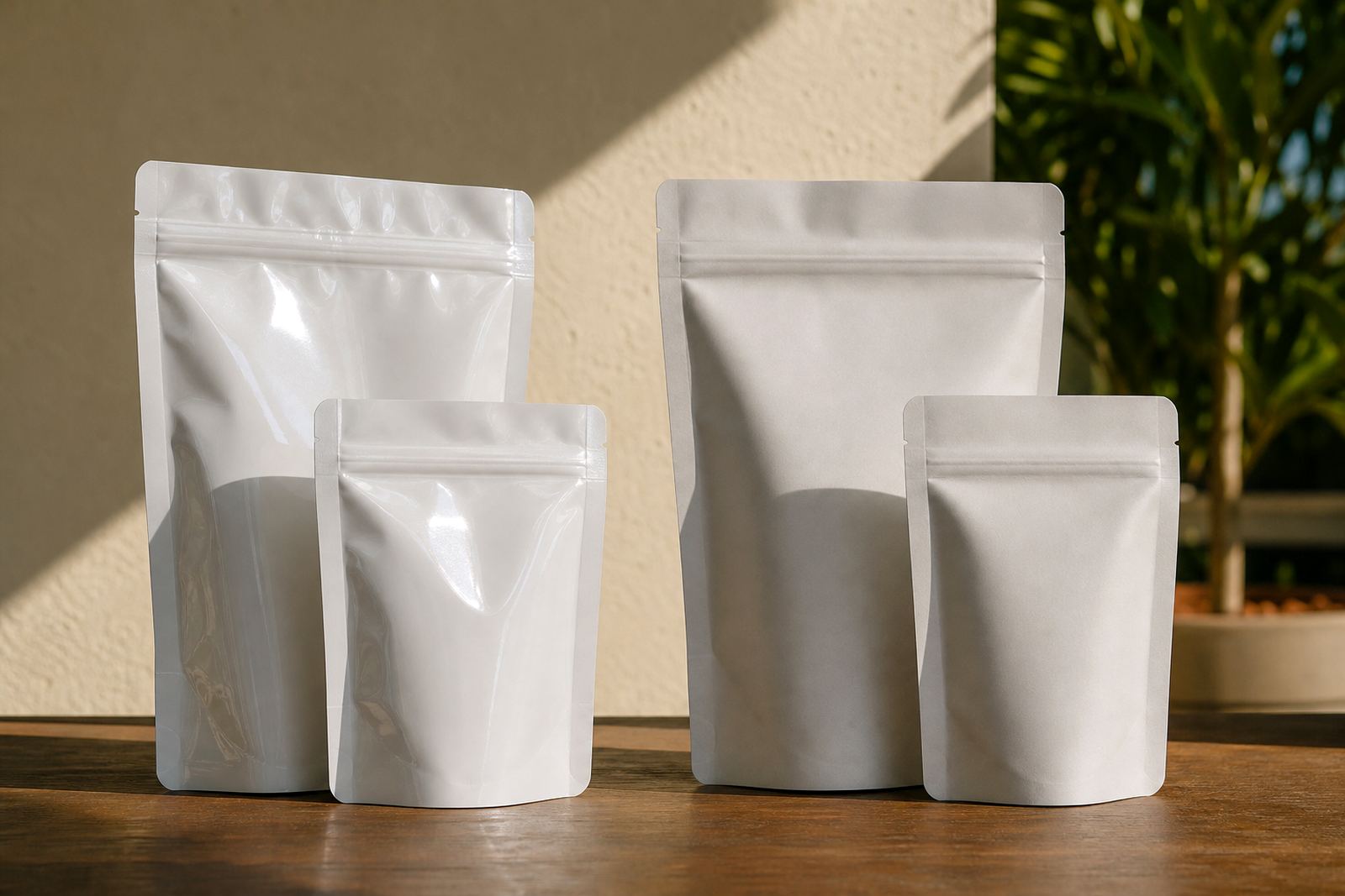
On flexible packaging, the finish is not only about looks. It changes how light sits on the pack, how colour reads on shelf and how the pack feels in hand. Gloss gives a brighter, more reflective surface. Matte gives a softer, lower-shine look that can feel more restrained and premium without trying too hard.
For pouches, sachets and wraps, the finish also affects how artwork shows up when the pack is folded, sealed or handled during packing and transport. A gloss finish can make bold colour blocks and photos pop. Matte can tame busy layouts and make text feel easier to take in at a glance. The right choice often comes down to the product, the target market and where the pack will be sold.
In Pinetown and across KwaZulu-Natal, many brands ask for a finish that can handle coastal humidity, warehouse handling and long distribution routes. The answer is usually practical: choose the finish that supports the product story and still prints well on the chosen material.
When gloss makes more sense for printed flexible packaging
Gloss is a strong option when the aim is visual impact. It can help colours look punchier and give a pack a lively, polished appearance. This is useful for fast-moving retail lines, impulse buys and packs that need to stand out in crowded fridges, shelves or display bins.
It can also be the better choice when the design uses photography, large colour fields or shiny visual cues. A gloss surface catches light and makes those elements feel brighter. For some products, that shine suggests freshness or energy. For others, it simply helps the pack read from a distance.
Gloss is often selected for the following reasons:
- Brighter colour presentation on shelf
- Stronger shine for bold branding
- Good fit for high-contrast artwork
- Useful where the pack must be noticed quickly
- Often preferred for lively, promotional or seasonal packs
If the product sits in a busy retail setting, gloss can help it hold attention. That said, very shiny packs can show scuffs more easily, so the handling of the product matters too.
When matte gives the better result
Matte is usually chosen for a more muted and controlled look. It reduces glare, which can make smaller text, subtle tones and fine line work feel calmer on the eye. If your brand wants a more restrained appearance, matte is often the better route.
It can also suit products positioned as thoughtful, refined or ingredient-led. On certain pouch formats, matte gives the surface a smoother visual field so the artwork feels less busy. That can be handy where there is a lot of mandatory information, barcode space or multilingual copy and the layout still needs to breathe.
Matte is often used when a brand wants:
- Less glare under shop lighting
- A softer, more subdued presentation
- Clearer reading of text and panels
- A finish that feels less flashy and more deliberate
- Better visual control on detailed artwork
For some wrap applications, matte can also help the product look neater after packing, because reflections are not bouncing off every fold. It is a practical choice where appearance has to stay tidy from production through to store placement.
How finish affects colour, artwork and proofing
Finish changes how colour behaves, so it should be considered during artwork prep and proofing, not after the fact. A colour that looks strong on screen may land differently on a gloss or matte surface. Deep blues, greens and blacks can read very differently depending on the finish and the material under it.
With flexo printing, artwork should be checked for fine detail, overprint issues and legibility in the chosen finish. Small text on a matte pack may look clearer, while large solid areas can appear richer on gloss. Neither is automatically better. The result depends on the artwork, substrate and print setup.
Before final sign-off, it helps to ask these questions:
- Will the product sit under bright retail lighting?
- Does the design rely on shine or on a softer look?
- Are there small words or legal panels that must stay easy to read?
- Will the pack be touched often in transit or on shelf?
- Does the finish match the market position of the product?
A proper proofing step saves time later. It is far cheaper to check the finish early than to rework a print run after the pack has already been approved.
Matching finish to pack format and filling line
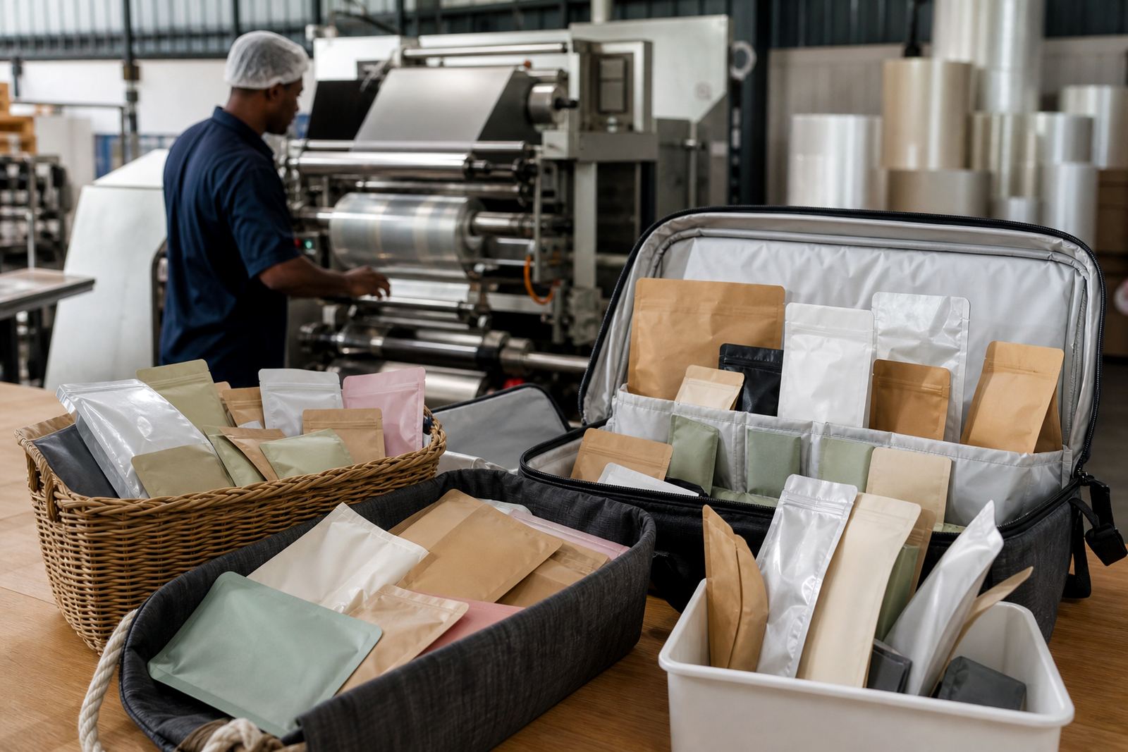
Different flexible packaging formats behave differently. A sachet has less surface area, so finish choices are often about quick recognition and clean information hierarchy. A pouch gives more room for branding, product details and graphic treatment, which makes finish more visible. Wraps sit differently again, because they are often viewed in motion as they move through the packing process or across the shelf.
The filling line matters too. If packs are sealed, stacked, transported or handled in warmer conditions, the finish needs to stay presentable after normal use. In places like Durban and Pietermaritzburg, humidity can be part of the daily reality and that can affect how a pack feels in storage and dispatch. In Gauteng, dusty distribution routes and repeated handling can also influence the final choice.
For short run orders, repeat production and regional dispatch, it helps to keep a consistent finish across batches. That makes it easier to maintain the same shelf look from one order to the next, especially where local brands sell in multiple provinces.
A practical local example from Pinetown
A KwaZulu-Natal brand launching a new food or household line may want the pack to look confident in Durban stores and still travel well to Johannesburg, Pretoria, Cape Town and Bloemfontein. If the artwork is bold and the pack needs immediate shelf presence, gloss can be a good fit. If the brand is aiming for a more measured look with plenty of written information, matte may be better.
For example, a pouch going out from Pinetown to coastal stores might need a finish that keeps colour lively but does not look too shiny under strong shop lights. Meanwhile, a sachet aimed at repeat buying in township retail or forecourt shops may do well with gloss if the brand wants quick visual recognition. There is no single right answer, only the finish that works best for the product and the route it follows.
In practice, the best decision usually comes from a short discussion about the product, the print run, the artwork and the dispatch plan. That is where packaging consultation, colour matching and material selection matter most. A good choice at this stage keeps the final pack looking the way it should, not just on day one but after packing, loading and delivery too.
Choosing with confidence before print run approval
Gloss or matte is not just a style choice. It is part of how the pack performs, how it is read by buyers and how it fits the brand. If the finish supports the artwork and the distribution plan, the pack has a better chance of doing its job without fuss.
For South African brands, especially those selling across different climates and retail settings, the practical route is to review the finish alongside the substrate, colour expectations and pack format. When those pieces line up, the result is easier to approve and more consistent to repeat.
If you are comparing gloss and matte for pouches, sachets or wraps, start with the product story and the shelf setting. The finish should support both. That is the simplest way to choose well, and it usually saves time later.