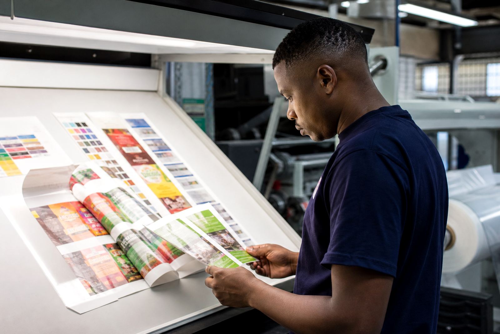
Why A Swatch On Paper Can Mislead On Film
Paper takes ink in a different way to film. A printed sample on coated board may look brighter, flatter or more solid than the same artwork on a flexible pouch or sachet. That does not mean the job is wrong, it means the material is behaving differently under the ink and the light.
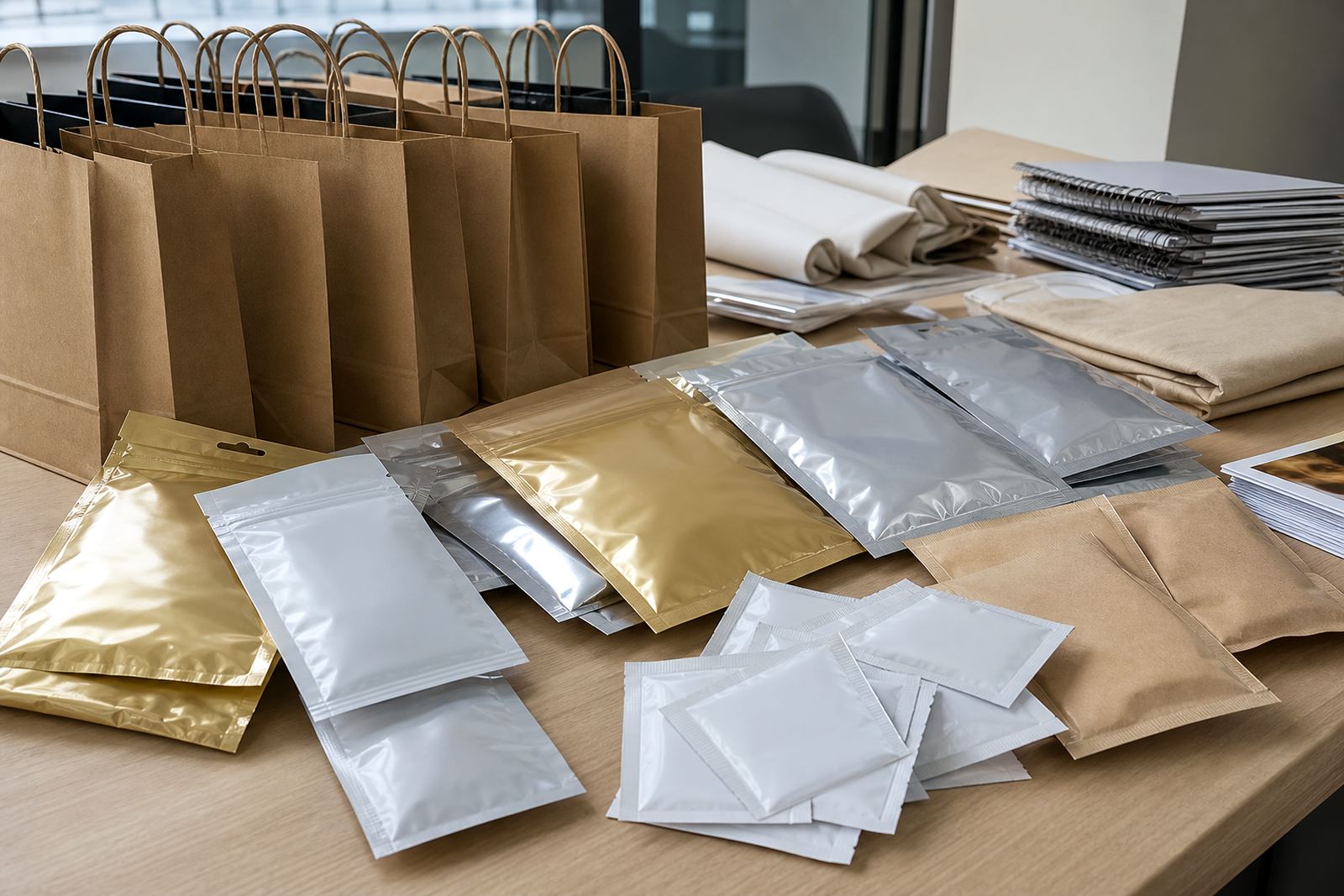
On flexible packaging, the surface can be glossy, matt, metallic or lightly textured. Each finish changes how the eye reads colour. A deep blue on a smooth wrap may look stronger than the same blue on a matt pouch, where the light is scattered instead of reflected. In Pinetown and Durban, where many brands use flexible packs for fast-moving goods, this is one of the first things we explain before approval.
It is also why a branded colour should be checked on the actual print substrate wherever possible. A paper sample is useful for direction, but it should not be treated as the final answer for flexible packaging.
What Changes Colour On Flexible Packaging
Several practical things affect how colour appears once it is printed on film. Some are small, but together they can shift the result enough to matter on shelf. The most common are ink laydown, film colour, opacity and the way the pack is sealed after printing.
- Film base: Clear, white or metallised film all influence the final colour.
- Surface finish: Gloss can deepen colour while matt can soften it.
- Ink coverage: Lighter coverage may allow the substrate to show through more than expected.
- Artwork detail: Thin lines and pale tints can lose clarity on smaller sachets.
- Run conditions: Speed, temperature and drying can affect consistency across the roll.
For local brands moving stock through Durban humidity or inland winter dryness in Johannesburg, the material condition on the day can also influence handling. Film that has been stored badly can behave differently during printing and converting.
How Flexo Printing Handles Colour Consistency
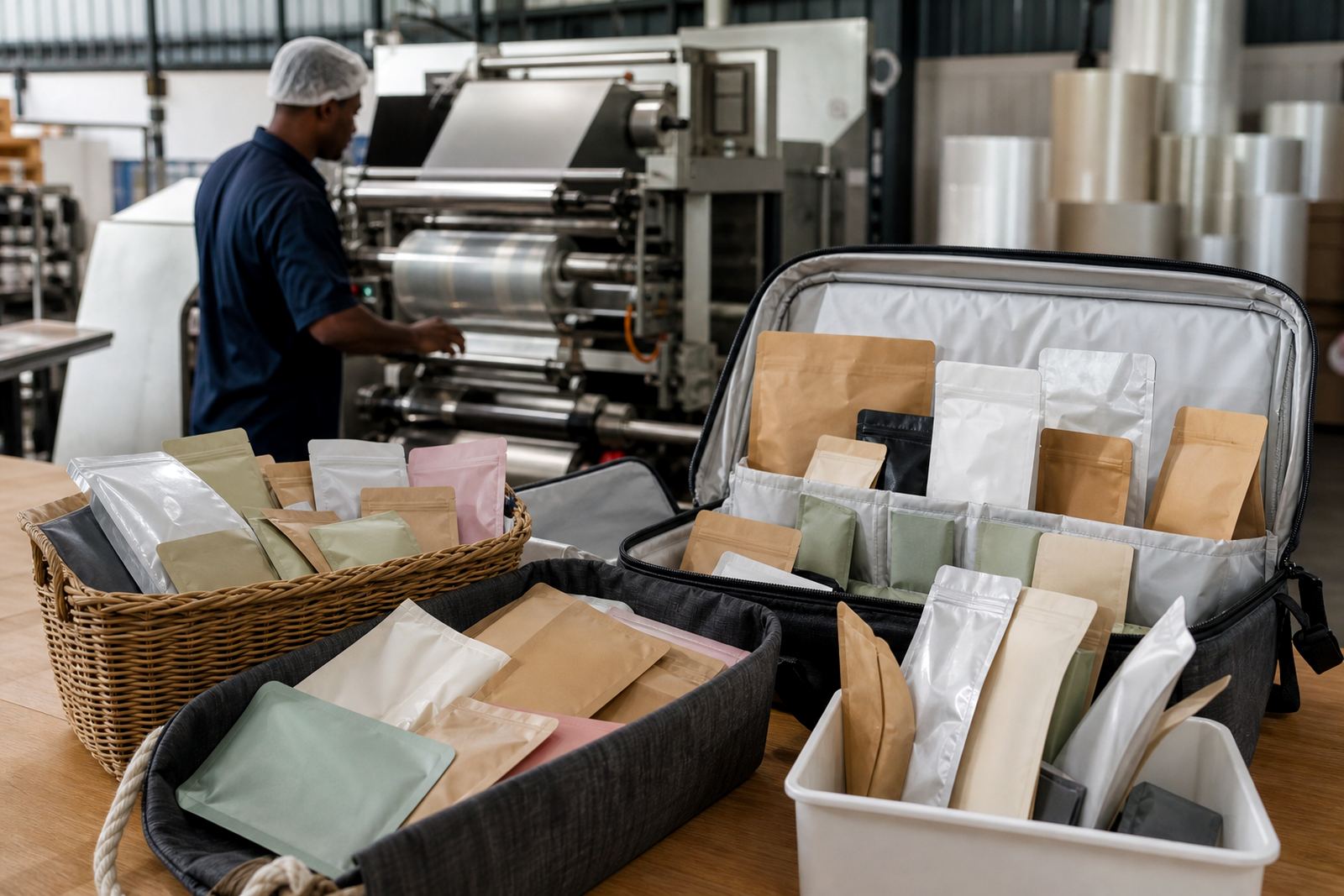
Flexo printing is well suited to flexible packaging, but it still needs careful setup. Plate quality, anilox selection, ink mixing and pressure settings all play a role in how colour lands on the film. If one setting is off, the shade can drift from batch to batch.
That is why colour matching is never only about a visual guess. It is about comparing the target, the substrate and the press conditions together. When a client asks for repeat production, we keep the earlier job in mind so the next run sits close to the same tone. That matters for pouches on retail shelves, wraps on multipacks and sachets packed for promotional use.
Practical control helps more than big promises. A careful prepress check, a proper proof and clear sign-off reduce surprises later on the line.
What To Check Before Approving Artwork
Before signing off on a print job, it helps to check more than just the picture on screen. A pack can look ideal in a PDF and still need adjustment once the inks meet the film. The aim is to reduce costly rework and avoid a run that does not match the brand you had in mind.
- Ask which film will be used, not only the size of the pack.
- Confirm whether the finish is gloss, matt or a combination.
- Check whether the background is solid colour or has a transparent area.
- Review small text and pale shades at final size, not enlarged on screen.
- Request a printed proof when colour accuracy is important.
If your product is going to Cape Town, Bloemfontein or Pretoria, the pack may sit on shelves under different lighting and in different store conditions. That can make a slight colour shift more visible than you expected. A sensible approval process helps protect the look of the brand across all deliveries.
Why Small Packs Need Extra Care
Sachets and narrow wraps are less forgiving than larger packs. There is less room for detail, and the viewer often sees the pack at arm’s length for only a second. A pale logo or fine line that works on a carton may disappear on a small sachet, especially if the film is reflective or the print area is tight.
That is why artwork prep matters so much. The image must be set up for the actual format, not copied across without adjustment. For repeat sachet production, even a slight change in layout can make the pack easier to read and better balanced on shelf.
When brands in Pietermaritzburg or Ballito need short run orders, there is often less margin for trial and error. The job has to move through proofing and production with a clear understanding of the final look. That saves time and keeps the packaging practical for dispatch.
A Local Example From Pinetown To The Rest Of South Africa
A common scenario is a KwaZulu-Natal brand that brings in a paper sample from a designer and expects the same colour on a pouch. On paper, a warm red may appear rich and flat. On film, especially if the pack has a glossy finish, the same red can look brighter and a little lighter than expected. If the background is white film, the red may also feel cleaner and sharper than it did on paper.
With the right checks, the result can still be close to the brand intention. We would look at the film, confirm the artwork, check the proof and then set the print conditions around that target. For a business shipping from Pinetown to Durban, Johannesburg, Pretoria or Cape Town, that sort of practical prep avoids extra transport and delays.
Colour on film is not a problem to fear. It is something to plan for, especially when packs must travel across South Africa and still look consistent when they arrive.