
When a small change makes more sense than a full redesign
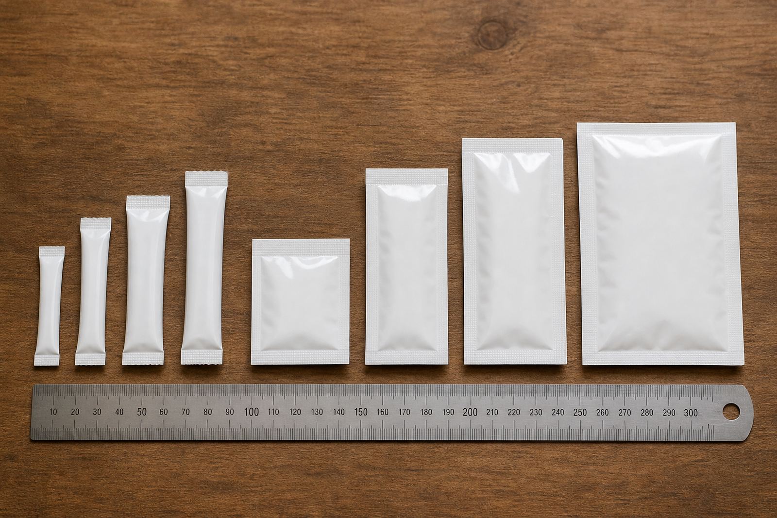
Many local brands want a fresher look but do not need to start from scratch. A small change can be enough when the product is already selling, the shape works, and the team only needs the pack to feel more current. That might mean adjusting colour blocks, tightening the layout, or changing the way product details are presented on pouches, sachets or wraps.
For businesses in Pinetown and across KwaZulu-Natal, this approach also helps keep decisions practical. You can keep the same pack size, the same basic structure and the same filling line, while improving how the product presents on shelf. That matters when production windows are tight and stock levels have to be managed carefully.
A refresh is often the better path when the current pack is still recognisable, but looks crowded, dated or hard to read. It is also useful when a range is growing and needs a cleaner family look across different flavours, sizes or variants.
Colour and layout changes that shift the whole feel
Colour is usually the quickest place to start. A small shift in background tone, a stronger contrast for text, or a more disciplined use of one accent colour can change the feel of a pack without changing the whole structure. Flexo printing gives good control over these details when the artwork is prepared properly and the same colours are kept consistent from run to run.
Layout changes can also do a lot of work. If a pouch front is too busy, simplifying the front panel can make the product easier to scan on shelf. If a sachet looks thin or cluttered, better spacing and clearer hierarchy can make it easier to read in one glance. These are modest changes, but they affect how people notice the pack.
- Reduce the number of competing text blocks on the front panel.
- Use clearer contrast between the background and key product information.
- Bring the logo or main product name into a stronger position.
- Keep flavour or variant coding simple across the full range.
Small layout adjustments usually cost less than a complete redesign, and they are easier to roll out across repeat production too.
Material choices that change handling and presentation
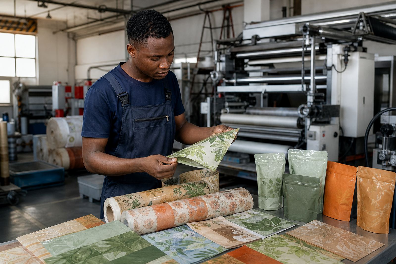
Sometimes a pack refresh is not about the printed artwork only. A change in material can improve handling, shelf shape or how the pack feels in hand. For flexible packaging, that could mean reviewing the substrate, thickness, sealing performance or finish so the pack suits the product and the filling process better.
In a coastal area like Durban, material choice can matter because humidity affects storage and handling. In hotter inland routes, transport and warehouse conditions can also influence how a pack performs before it reaches the shelf. A practical refresh takes those realities into account, not just the artwork itself.
When clients are choosing between pouches, sachets and wraps, the right material selection should support the product rather than fight it. If the current pack wrinkles too much, opens too awkwardly or looks inconsistent from batch to batch, a small change in material or construction can help. It is often a quiet fix, but it makes the end result look neater.
- Check whether the current finish suits the product and display conditions.
- Review sealing and handling needs before changing the print face only.
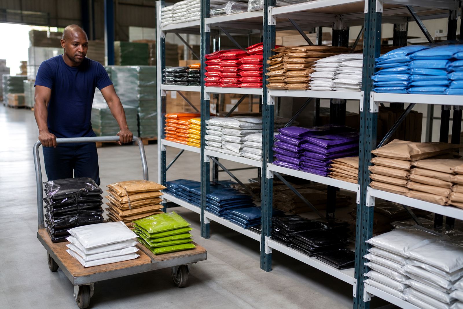
- Match the material to storage conditions and delivery routes.
- Ask whether the pack can be simplified without changing the filling setup.
Proofing and colour matching before the first run
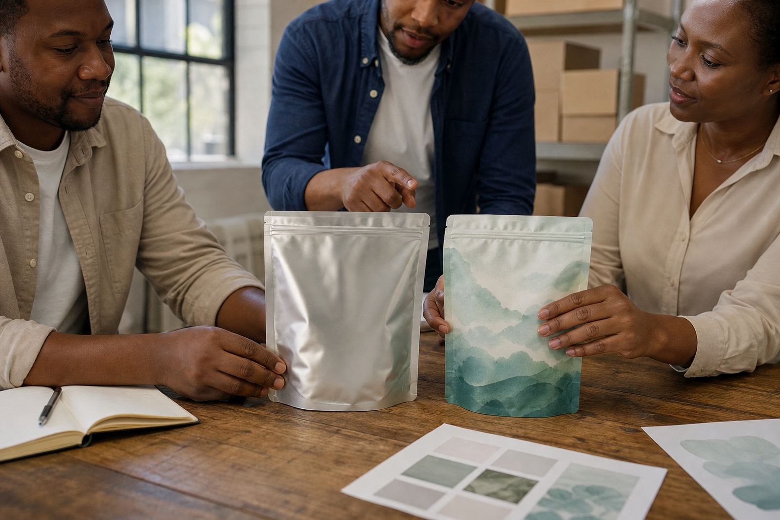
Good pack refreshes depend on careful prep. A small change can go wrong if the proof is rushed or the colour match is not checked properly. This is where artwork prep, print proofing and colour matching matter. A shift that looks tidy on screen may need adjustment once it is on film, especially when a brand wants to keep an existing look but brighten it slightly or sharpen a specific colour.
For a local brand in Pietermaritzburg, for example, a sachet range may only need cleaner product names, stronger flavour coding and a more balanced front panel. That sounds minor, but it can make the full line look more organised on shelf. The same approach works for Johannesburg and Pretoria buyers who need the range to read quickly in busy retail settings.
It helps to compare the old pack and the revised version side by side before production starts. That way, the team can check what has changed and what must stay the same. A little care here saves time later and cuts down on repeat corrections.
How to refresh pouches, sachets and wraps without slowing production
The best refreshes respect the production line. If a pack is being printed, converted and dispatched locally, the changes should fit the practical steps already in place. That means confirming dimensions, seal areas, repeat quantities and artwork placement before anything goes ahead. A design that looks good but slows packing is not a good change.
Repeat production can make this easier. If the core format stays stable, you can refresh the artwork or a few visual details and keep the rest of the setup familiar. That is useful for brands that need steady supply into Cape Town, Bloemfontein or Gauteng, where delivery timing and stock planning are important.
Simple changes that often work well include:
- Updating the front panel while keeping the back panel structure familiar.
- Changing the colour treatment for one variant at a time.
- Cleaning up product claims and instructions so they are easier to read.
- Refining the outer wrap or sachet presentation to match the main range.
These steps help a product look more current without forcing a full rework of the whole packaging system.
A Pinetown example of a practical refresh
A food or household brand in the Pinetown area may start with a pack that still works, but looks tired next to newer products on shelf. Instead of changing the format completely, the business can keep the same pouch size and improve the front layout, adjust the colour balance and clean up the typography. The result is a neater pack that feels more deliberate, without disrupting supply.
That kind of refresh is useful for local teams because it keeps the conversation focused on what matters: what the product needs to say, how it should look on shelf, and how it should move through production and dispatch. It is a practical way to keep pace with the market when budgets are tight and time is limited.
At Flexography Printing Co in Pinetown, the process usually starts with a clear discussion about the current pack, the target look and the supply route. From there, the team can look at flexo printing, pouch converting, sachet production or wrap printing, along with artwork prep, proofing and dispatch coordination. Clients across Durban, Johannesburg, Pretoria, Cape Town and Bloemfontein can work through the enquiry form on the contact page and keep the process straightforward.