
Why a clear panel helps buyers make quicker choices
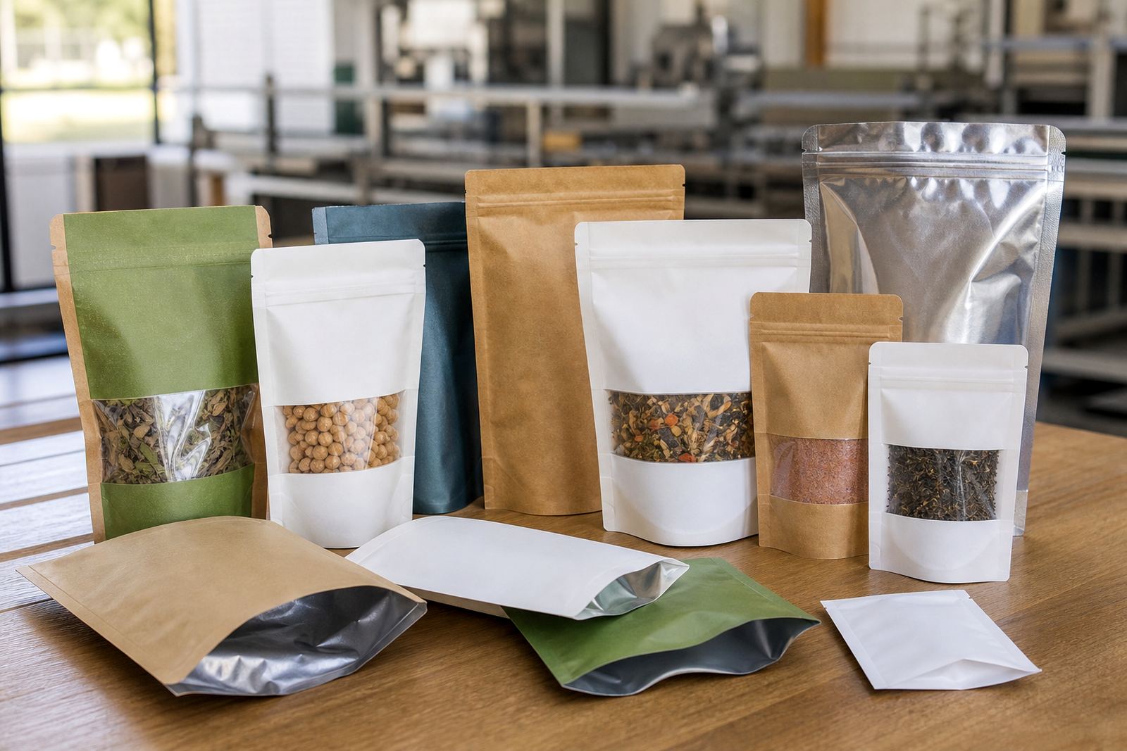
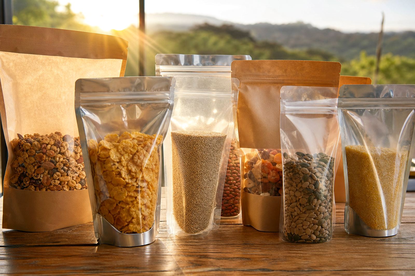
A window pouch gives shoppers a glimpse of the product before they buy. That matters when a pack sits among many similar items, because the clear panel reduces uncertainty. People can see texture, size and fill level, which is especially useful for snacks, grains, dried fruit, pet treats and non food items that rely on visual appeal.
For local brands, this can help the pack do two jobs at once. The printed area carries the name, product details and branding, while the clear section shows the real contents. That simple mix often works better than a fully printed pouch when the product itself is part of the selling point.
- Supports quicker shelf decisions
- Lets the product speak for itself
- Still leaves room for branding and legal copy
- Can suit both small packs and larger retail formats
Where window pouches work best in South African retail
Window pouches are used across a wide range of categories, from food items to craft materials and home use products. In practice, the right format depends on the product weight, how it is stored, and whether the pack must be hung, stacked or displayed upright.
A supplier in Pinetown shipping to Durban, Johannesburg or Cape Town may choose different pouch structures for different channels. A market stall needs a pack that is easy to display and reseal where possible, while a national retailer may want consistent pack size for shelf filling and carton handling. Local climate also plays a part. On the coast, humidity can affect how a pouch behaves in storage, so material selection needs proper attention.
- Snacks and dry foods
- Pet treats and feed portions
- Powders, seeds and blends
- Craft items, accessories and hardware parts
How flexo printing keeps branding clear around the window
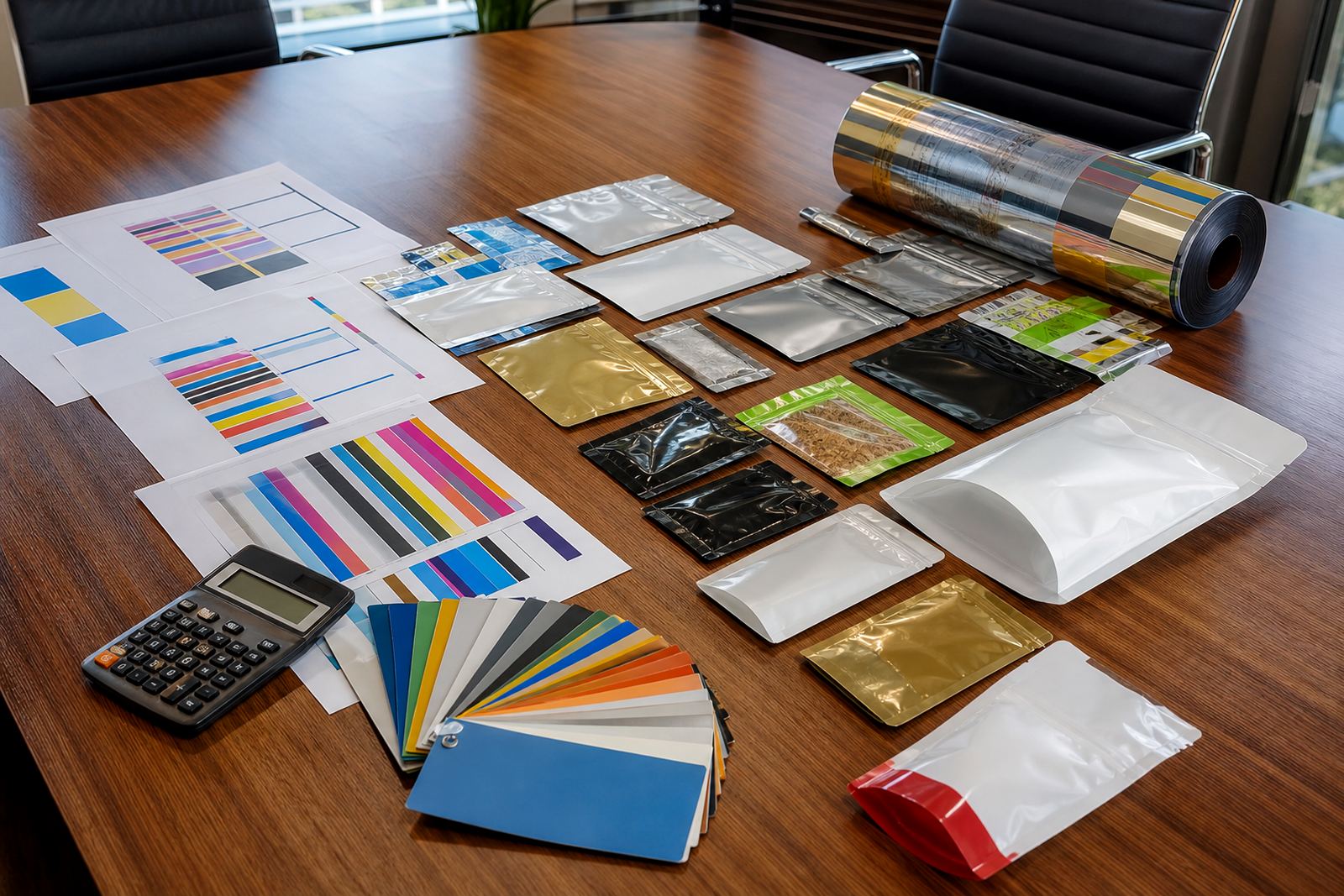
Flexo printing is well suited to repeating jobs and practical packaging runs. The printed areas around the clear panel need clean colour, sharp type and careful layout so the window does not feel like an afterthought. Good artwork prep makes a big difference here, especially where barcodes, ingredients, instructions or batch areas must stay legible.
The aim is not to cover every surface. It is to place the design where it has the most impact. A strong logo panel at the top, product details below and a clean clear window in the middle can create a tidy package that is easy to read on shelf. If the product is naturally colourful, the window can become part of the design rather than just a cut out section.
Colour matching also matters when brands repeat orders over time. If a pack is used for short runs and repeat production, the printed areas should stay consistent from one batch to the next. That helps when a product is sold in Durban one month and Bloemfontein the next, because customers still recognise it quickly.
Practical design choices that improve shelf appeal
The most effective window pouches keep the layout simple. Too much text around the clear section can make the pack feel crowded. A cleaner structure usually works better, especially when the product inside has strong visual value.
Before production, it helps to think through how the pouch will stand, hang or fold. The placement of the window should not interfere with sealing, tear notches or the main brand panel. For some products, a small front window is enough. For others, a larger panel gives buyers more confidence. The right answer depends on the contents and the retail setting.
- Keep the clear area positioned where the product is most attractive
- Leave enough printed space for brand name and key details
- Check how the pack looks when full, not only when flat
- Allow for sealing margins and handling during dispatch
A Pinetown example: local packs for regional and national supply
Consider a Pinetown brand packing flavoured crackers for delivery into Durban, Pretoria and Johannesburg. The product is appealing because of its colour and shape, so a window pouch can show that off while the printed panels carry the flavour name, portion details and branding. If the same brand later supplies Cape Town and Bloemfontein, the pack still works across different retail settings without needing a full redesign.
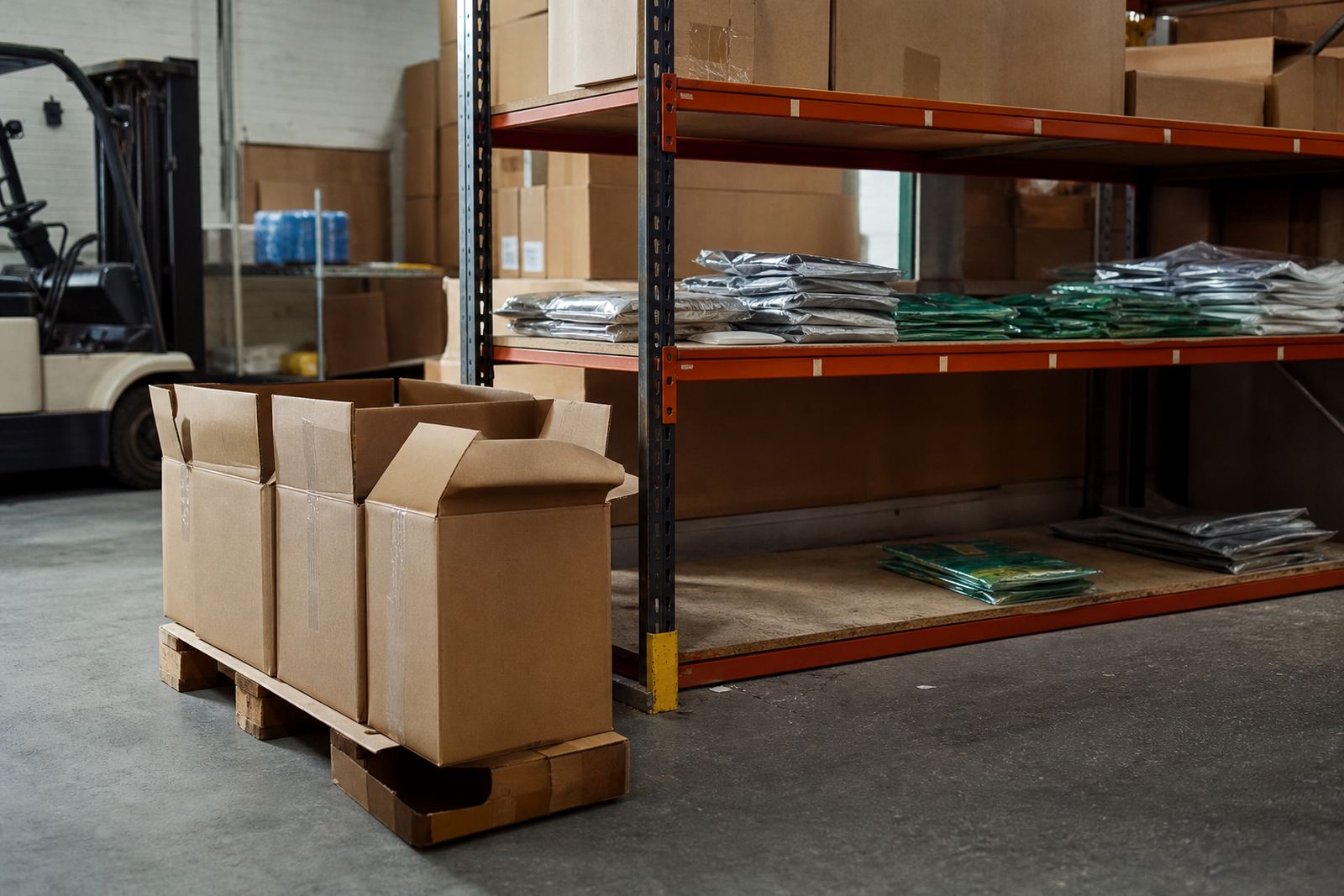
In that kind of setup, the production team must also think about logistics. Packs may be dispatched in mixed cartons, stored in warm warehouses or held for repeat production closer to peak trading periods. A window pouch that looks good but handles badly is not useful. The aim is a pack that presents well and survives the real conditions of South African distribution, from coastal humidity to inland heat.
Getting the balance right between visibility and protection
Window pouches are not about showing everything. They are about showing enough. If the opening is too large, the pack can lose wall space needed for branding and practical information. If it is too small, the visual advantage may be lost. That is why material selection, pouch format and print layout should be considered together.
For brands working with repeated orders, short runs or mixed delivery schedules, the best results come from clear planning before print proofing. Once the layout is settled, the pack can support the product in shop, in storage and during transport. In the end, a good window pouch helps customers see what they are buying and helps the brand keep its message on the front of pack. Thats the part that often makes the difference.