
Start With the Product, Not the Finish
Before you decide on gloss or matte, look at what the pack must do every day. A snack pouch for a retail shelf in Durban faces different handling to a sachet sent out in cartons to Johannesburg, and a wrap for a bulk order may need a different visual balance again. The finish should support the product, the pack size and the way it will be stored, packed and opened.
As a rule, start with the practical side first. If the product is likely to be stacked, handled often, or moved through long delivery routes across South Africa, the finish must keep the artwork readable and the pack neat. If the pack sits in a controlled display area, there is more room to focus on how the finish presents colour and detail. For local brands in Pinetown and surrounding areas, the best choice often comes from matching the finish to real use, not just the sample on a screen.
- Check where the pack will be displayed: shelf, carton, counter or bulk dispatch.
- Think about handling, humidity and transport time.
- Decide whether the brand needs a clean premium look or a high-impact retail look.
When Gloss Works Best
Gloss finish gives a brighter, more reflective look. It can make colour appear stronger and can help graphics stand out from a distance. For packs with bold blocks of colour, simple branding or fast-moving retail items, gloss often gives good shelf presence. It is also a practical choice where you want the surface to feel slick and polished in the hand.
Gloss can be helpful on products that need clear visibility in busy stores, especially where lighting is strong. It works well when the artwork includes bright tones, strong contrast or large image areas. On the production side, gloss can also suit packs that are checked quickly on line, because the surface often shows colour and print detail clearly. Still, gloss will show fingerprints and surface marks more readily, so it should be chosen with care for packs that are handled a lot.
- Use gloss when shelf impact matters most.
- Choose it for bold colour and sharp visual contrast.
- Consider how often the pack will be touched before it reaches the customer.
Where Matte Gives the Better Result
Matte finish gives a softer, lower shine appearance. It is often selected when a brand wants a calmer, more restrained look, or when the pack needs to feel less reflective under store lights. Matte can suit premium food ranges, personal care items and speciality products where the pack should look measured rather than loud.
Another benefit is that matte can be forgiving on packs that travel well but are handled more roughly in warehouses and loading bays. Scuffs may still happen, but the finish can make them less obvious than on a full gloss surface. For brands working through Pinetown, Durban and inland deliveries, matte is often worth considering when the product needs a neat appearance after long transit. It also helps text and fine line work read more gently, which can suit a cleaner design approach.
- Choose matte for a softer, more restrained appearance.
- Use it when glare under lights is a concern.
- Consider it where the pack must still look tidy after transport and stacking.
Using Mixed Finishes for Visual Focus
Mixed finishes combine gloss and matte areas on the same pack. This approach can be used to guide the eye, highlight a logo or separate key product information from the rest of the artwork. When done well, it creates contrast without needing extra colour or heavy artwork changes.
Mixed finish work is useful when you want the front panel to carry a stronger visual point, while the rest of the pack stays more subdued. For example, a matte background with gloss highlights can help a product stand out on shelf, yet still keep the overall pack calm. It is a good option for brands that want a little more detail in their presentation without moving into a fully shiny look. The layout must be planned carefully, because the finish line up has to match the artwork properly and proofing matters a lot here.
- Use mixed finishes to draw attention to logos, product names or key features.
- Keep the layout simple enough for the contrast to work well.
- Check that the finish changes suit the printed artwork, not fight it.
A Practical Selection Checklist Before You Approve
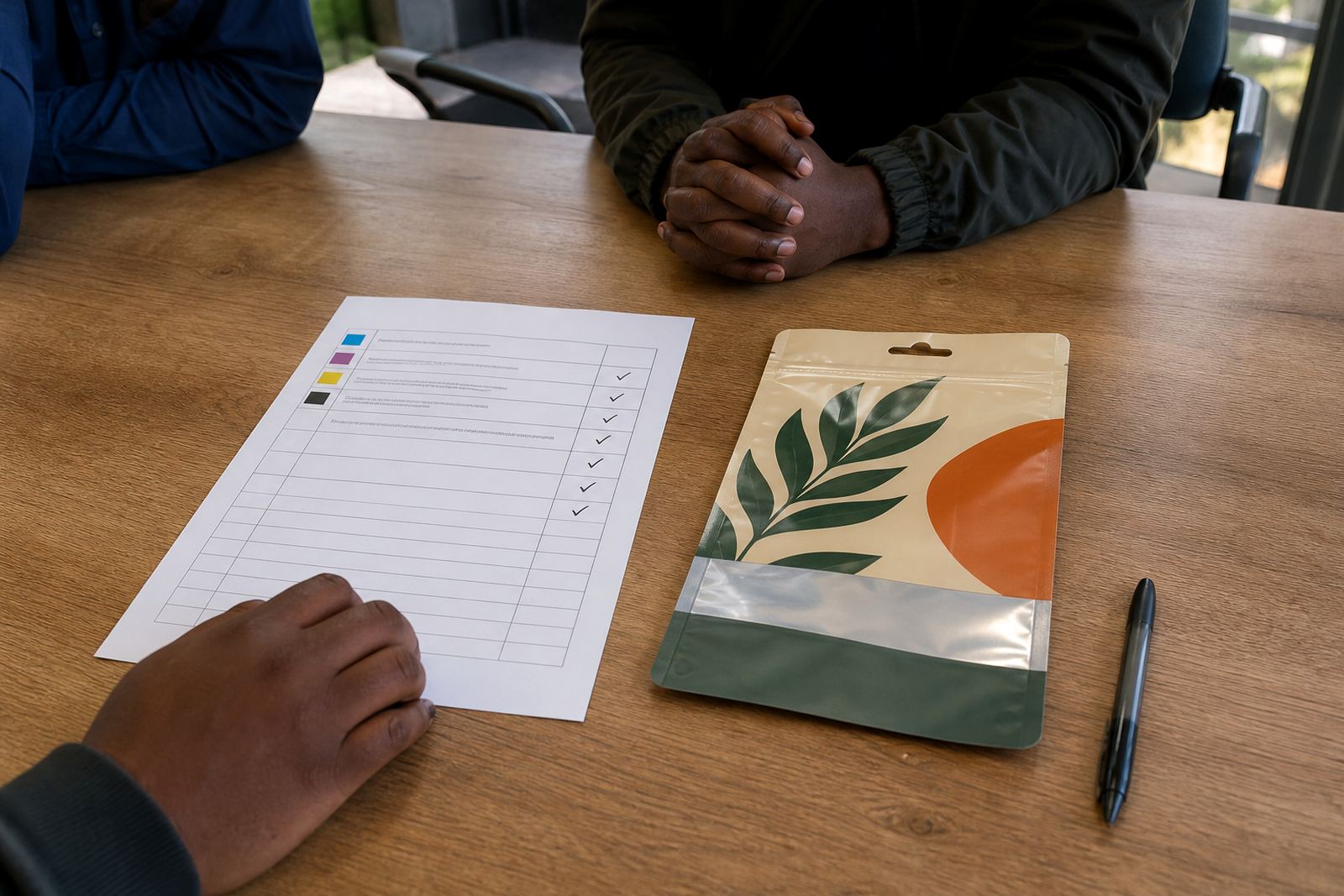
Before final approval, compare the finish against real pack conditions. Hold the sample under strong light, look at it from a distance and then from arm’s length. A finish that looks good in a meeting room may behave differently in a warehouse or in a retail aisle. It is better to test the look now than to fix it after print.
Use the checklist below as a practical guide. If a pack needs strong shelf impact and bold colour, gloss may be the clearest choice. If it needs a softer premium look and less glare, matte may suit better. If the brand needs a focal point without adding more design elements, mixed finishes can work well. Also consider the order quantity, repeat production needs and whether the product line will stay the same for a while or change often.
- Does the finish match the product position and price point?
- Will the pack be handled often during packing and delivery?
- Do you need more shine, less shine, or both?
- Will the finish still look good under store lighting?
- Is the artwork clear enough for the chosen finish?
How Local Conditions Affect the Final Look
South African conditions matter. Coastal humidity, warm storage areas and long delivery runs can all affect how flexible packaging looks by the time it reaches the shelf. Packs sent from Pinetown to Cape Town or Bloemfontein may spend days in transit, so the finish has to stay presentable through changing temperatures and handling. In some cases, a surface that hides minor marks better may be the safer choice.
Load-shedding also affects production planning, proofing and dispatch timing. That means finish choice should fit into a production schedule that is practical, not rushed. If you are repeating an order later, keep notes on what worked, what showed scuffs, and what the client preferred once the product was in market. Small notes like these save time and help keep repeat jobs consistent. For local brands, this is often the difference between guessing and choosing well.
When in doubt, speak to the team early. A short packaging discussion can save artwork changes later, and it helps match the finish to the product, the route and the final use. A good finish should support the pack without getting in the way of the brand message.