
Beauty Range Brief From Cape Town
The brief came from a beauty brand in Cape Town that wanted flexible packaging for a skincare and personal care range. Their existing packs were too glossy and busy, so the look felt crowded when lined up together. They wanted a simpler presentation with a softer finish, clearer front panel copy, and packaging that could move between counter display, e-commerce orders and travel-sized units without changing the brand feel.
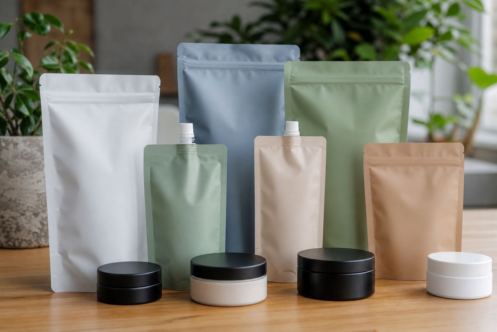
We worked on a set of matte pouches for the main retail range and travel sachets for sample and trial use. The aim was to keep the packs neat, easy to fill, and practical for handling in store and during dispatch. Because the products were going out in mixed volumes, the packaging also had to hold up to stacking, transit and day to day use in different parts of South Africa.
What The Project Had To Handle
The main challenge was balancing a premium look with production discipline. Beauty packaging can show every small colour shift, panel misalignment or text issue, so the artwork and print prep needed close control. The range also had to work across two pack types, meaning the branding had to stay consistent while the size, shape and use case changed.
- Matte finish needed across the range for a cleaner, less reflective shelf look
- Colour had to stay steady across pouch and sachet formats
- Front panel copy had to remain legible on smaller travel packs
- Pack structure needed to suit filling, sealing and retail handling
- Artwork had to work for repeat production without constant rework
Another practical point was local distribution. The packs would move from Cape Town to other centres, including Durban, Johannesburg, Pretoria and Bloemfontein, so the format needed to stay presentable through transport and warehouse handling. Coastal humidity was also part of the picture, so material choice and seal consistency mattered.
What We Supplied And Set Up
We handled flexo printing for the flexible packaging, then carried the work through pouch converting and sachet production. Artwork prep started with the supplied brand files, then we checked panel layout, text placement and colour values before print proofing. That gave the client a clearer view of how the final packs would sit in use, and reduced the chance of last minute changes.
The main pack format was a matte pouch for the beauty range, with smaller travel sachets for sampling and convenience. We also assisted with material selection, as the brand needed a film structure that was suitable for print quality and the practical realities of filling and sealing. The result was a cleaner pack face with less glare, which helped the product details stand out more naturally.
- Matte pouches for the core range
- Travel sachets for sample and trial packs
- Artwork prep and proofing before production
- Colour matching across both pack formats
- Dispatch coordination for delivery from Pinetown
Timeline And Production Flow
The project ran over 4 weeks from artwork lock-off to dispatch. Week one was artwork prep and proofing. Week two focused on print setup and colour matching. Week three covered production and converting. Week four was dispatch coordination and final pack-out for delivery. That sequence worked well because the client needed steady progress, not rushed turns that might compromise finish or legibility.
Because the packs were for a beauty range, we kept the production flow tight and practical. The team handled the job through prepress, print and logistics in-house, which made it easier to keep track of the detail. There was no need for back and forth over basic specs once the proof had been approved, and that helped keep the schedule on track despite a few small artwork adjustments.
Results On Shelf And In Transit
The final packs gave the range a calmer, more polished appearance. The matte finish reduced shine, so the print looked cleaner under shop lights and in product photos. The smaller sachets carried the same visual language as the main pouches, which helped the brand look consistent across retail, sampling and travel use. That consistency mattered because customers often see the small pack first before they meet the full-size product.
From a handling point of view, the packs moved well through dispatch and arrived ready for local distribution. The client was able to present the range with a more considered look, while still working within practical production limits. The project also made it easier to plan repeat production, since the approved colour and layout were already set for future runs. It saved time later on, which is what most busy teams need.
What We Would Repeat For A Similar Range
If we were doing the same type of beauty range again, we would follow the same approach: confirm the pack use first, lock the artwork early, and proof the colour against the actual material before full production. For beauty products, the finish has to support the brand story while still being practical for sealing, stacking and delivery.
- Start with the smallest pack size so text and spacing are checked early
- Confirm the finish before settling the print layout
- Keep the colour plan consistent between sachets and pouches
- Allow time for proofing where fine type or pale colours are used
- Plan dispatch with the destination cities in mind, especially for mixed weather and handling
For Cape Town brands shipping nationwide, that kind of planning makes a real difference. It keeps the packaging neat, reduces avoidable changes, and gives the client a repeatable setup for future runs. Our team at the Pinetown base would handle that the same way again, just with the same close eye on detail and a bit more lead time if the range grows.
Key facts
| Project type | Beauty range flexible packaging |
|---|---|
| Formats supplied | Matte pouches and travel sachets |
| Print method | Flexo printing |
| Project location | Cape Town, Western Cape |
| Production base | Pinetown, KwaZulu-Natal |
| Timeline | 4 weeks from proof to dispatch |