
The brief for a new spice range
The client was a growing food business in Polokwane preparing a spice launch for local retail and trade supply. The pack had to do three jobs at once: stand out in a busy spice aisle, keep the range looking like one family, and stay practical for packing, transport and repeated handling. They wanted flat pouches with strong colour blocks, clear product naming and enough space for legal copy without making the front feel crowded.
Because the range included several flavours and pack sizes, the main challenge was consistency. Each variant needed its own colour identity, but the set had to read as one brand from a distance. That meant careful planning on shade, layout and finishing, plus a print setup that could repeat well when the range expanded later in the year.
- Project type: spice range launch for a Polokwane based client
- Format: flat flexible pouches for retail shelf display
- Priority: strong shelf blocking and clear variant separation
- Distribution: local launch with delivery across South Africa
What the pack needed to handle
Spice packs get handled a lot. They are picked up, stacked, moved between depots, and often sit in warm shops where the packaging must keep its shape and colour. The client also needed a format that would run well on their packing line without fuss. That meant a pouch structure that could be filled consistently, sealed cleanly, and stored neatly in cartons. In Polokwane, where dry conditions can be hard on stock rooms, we also looked at how the pack would behave during storage and transit.
The brief included a few constraints. The artwork had to carry ingredients, weights and general product information without clutter. The family look had to work across different flavours, and the colour separation needed to stay clear even under mixed lighting in retail stores. We also had to keep the artwork practical for future repeat production so the range could be run again without starting from scratch. There were a few moving parts, but the aim stayed simple: good shelf presence and fewer problems on pack day.
- Clear front panel for product name, variant and visual block colour
- Enough space for required copy, barcode and batch coding
- Repeatable layout for future runs and line extensions
- Pack format suitable for carton packing and transport
Artwork prep, proofing and colour matching
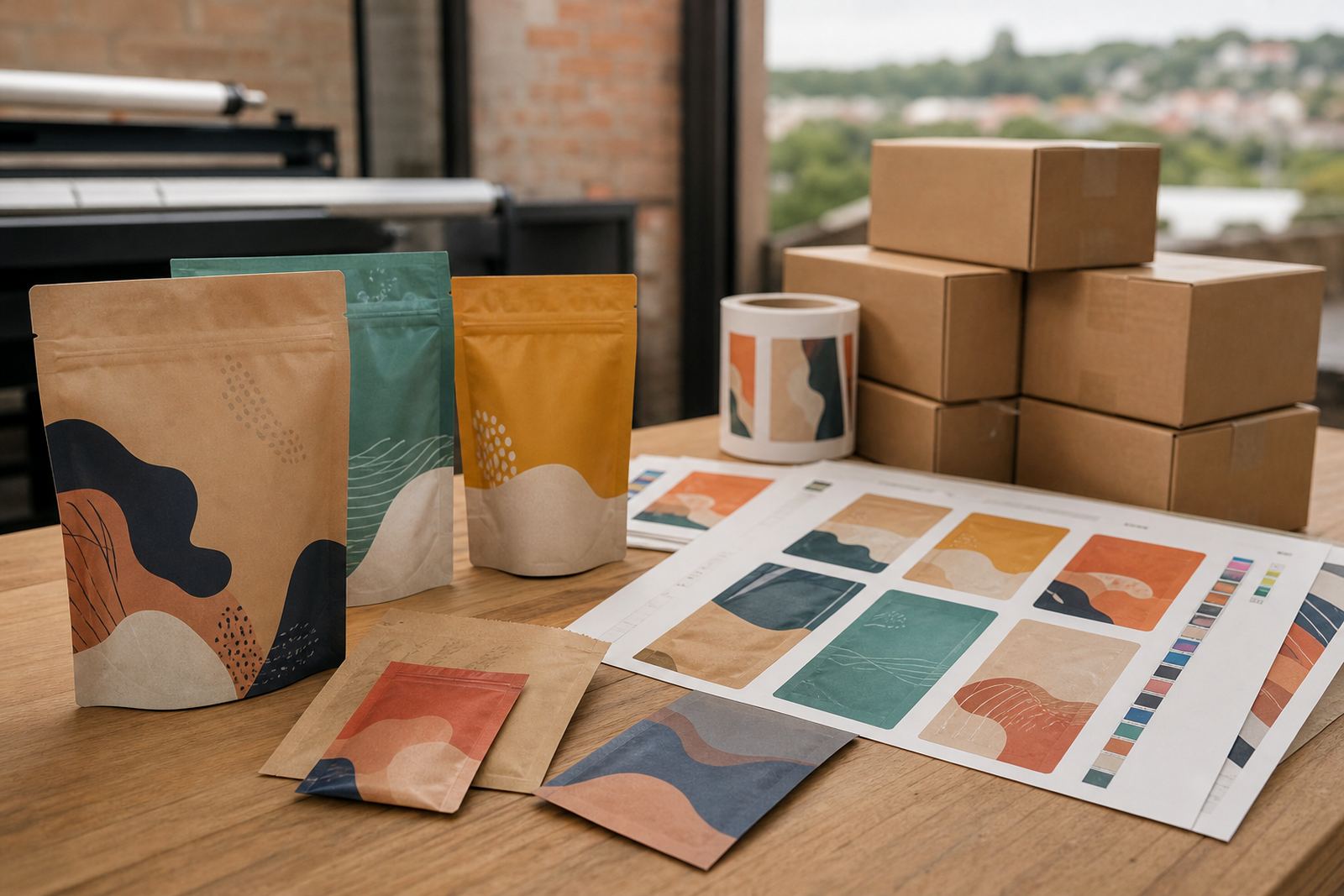
Our team handled the artwork prep, prepress checks and proofing so the range could move from concept to press with fewer delays. Jason Petersen reviewed the artwork for positioning, bleed, overprint and barcode placement, while Priya Naicker and Thandiwe Mkhize kept the client informed on variant changes and proof approvals. We also worked through colour matching so each flavour kept its own identity while still fitting the wider family look. Small changes to saturation and contrast made a big difference on shelf.
Because flexible packaging is unforgiving when it comes to registration and ink balance, we kept the layout practical rather than overworked. The final route used bold flat colour areas, clear typography and a structure that held together across all variants. Siyabonga Ndlovu stayed involved on the project side, making sure the format, timing and dispatch plan matched the launch window. It sounds simple, but a clean spice pack takes proper discipline in prepress and not just a pretty mock-up.
- Artwork prep for all variants in the range
- Proofing to check copy placement and visual balance
- Colour matching across family colours
- Print-ready setup for repeat production
Production on the flexo line
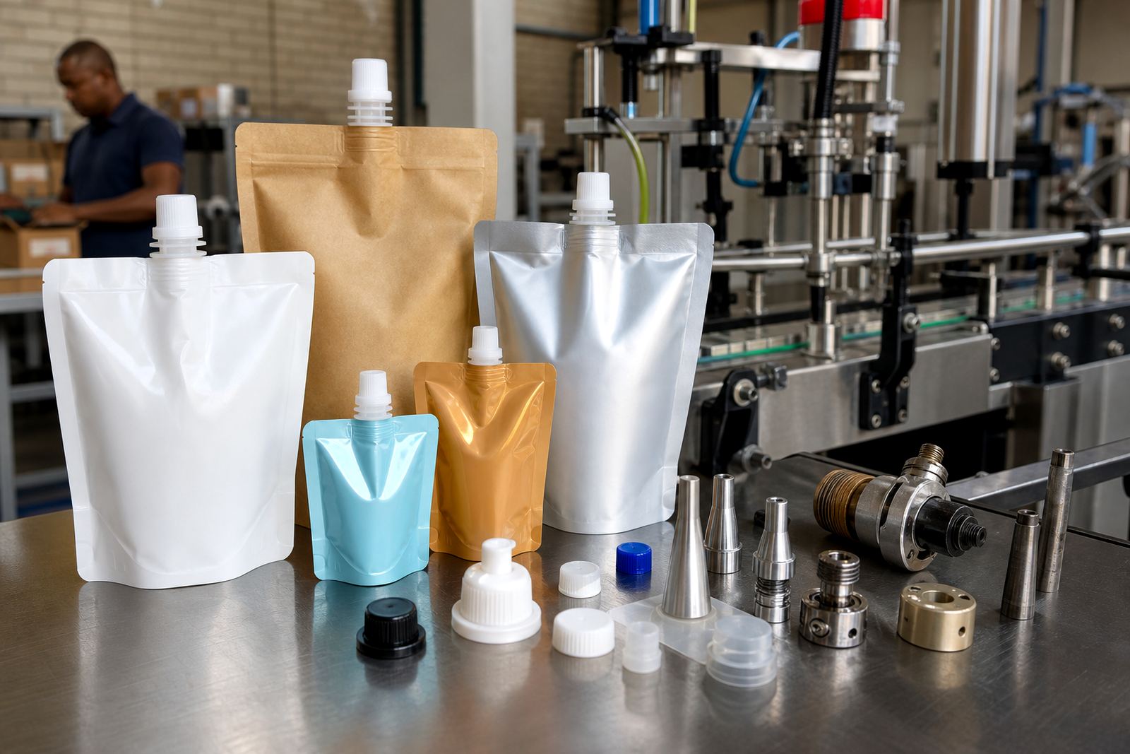
Once the proofs were signed off, Marius van Wyk oversaw production on the flexo printing side and the converting team prepared the pouches for finishing. The job ran as flat pouches with strong panel separation and neat sealing edges, chosen for a clean retail look and easy filling. We kept the material selection practical for the product and the route to market, with an eye on shelf life presentation, handling and stacking. The job was printed in a way that supported clear colour blocking and readable copy at normal shelf distance.
We supplied the client with a consistent set of pouches for the launch run, then prepared repeatable settings for later orders. That matters when a brand starts moving from first release into regular trade supply. If the pack changes too much between runs, the shelf looks uneven and the whole range loses its shape. For this project, repeatability was just as important as the first print. The press work, converting and final checks all had to line up, and they did.
- Format supplied: flat pouches for spice products
- Production focus: clean registration, sharp text and stable colour blocks
- Converting: filled and sealed-ready pouch format
- Quality checks: print alignment, finish and pack consistency
Timeline from briefing to delivery
The project ran over four weeks from first brief to dispatch. Week one covered the brief, pack structure and artwork planning. Week two went into proofing and colour sign-off. Week three was production and finishing. Week four covered dispatch coordination and delivery planning for different destinations. The schedule was tight, but not rushed, which is usually the right balance for a launch pack. There is no point saving a day if the colours arrive off or the copy is hard to read.
As the client was based in Polokwane, we also coordinated delivery routes to suit the launch plan, including destinations in Durban, Johannesburg, Pretoria, Cape Town and Bloemfontein. Our logistics team, led by Lerato Molefe, kept the movement organised so cartons could go out in the right sequence. For a national launch, timing matters just as much as print quality. Shops do not wait around for late stock, and neither do distributors.
- Week 1: brief, format selection and artwork planning
- Week 2: proofing and colour approval
- Week 3: flexo production and pouch converting
- Week 4: dispatch coordination and delivery
Results on shelf and in trade
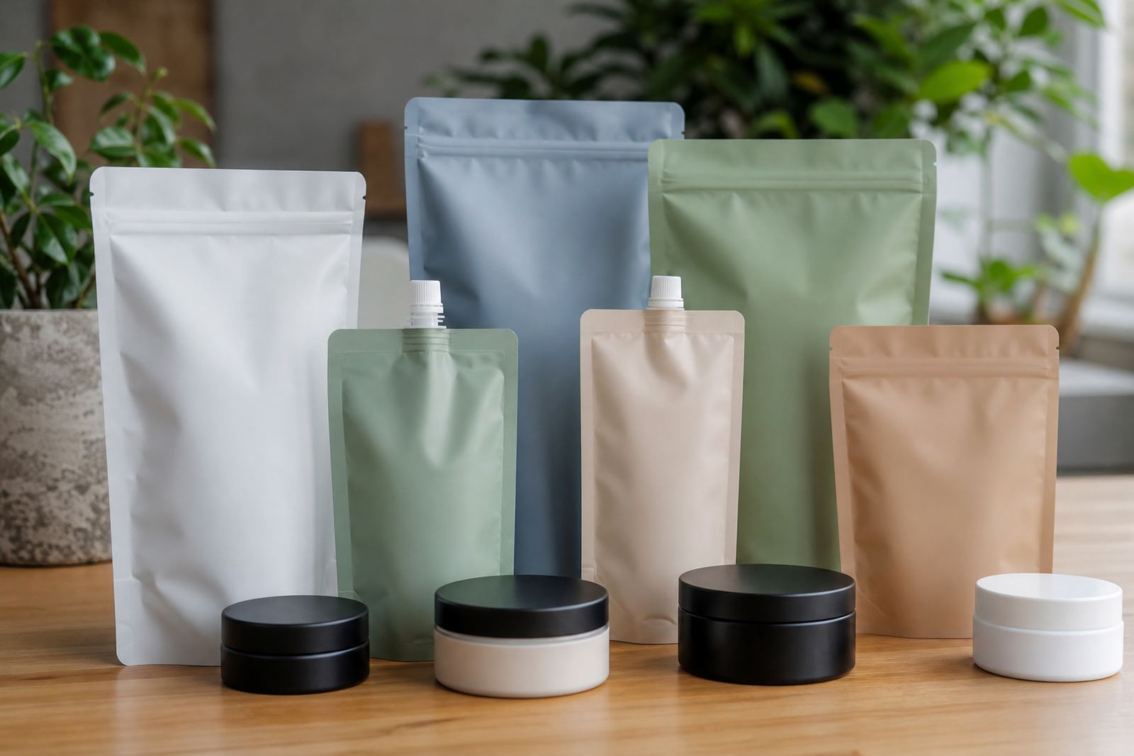
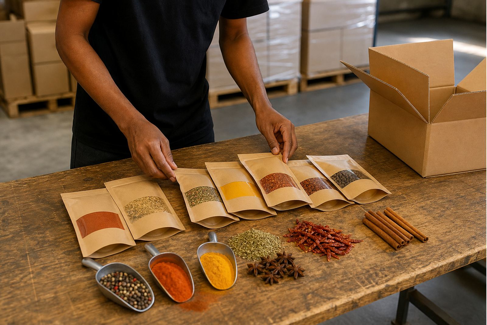
The finished pouches gave the new spice range a clear shelf-blocked look with distinct colour coding for each variant. That made it easier for shoppers to scan the range quickly and helped the client present a family of products rather than separate items. The packs also held up well through handling and dispatch, which matters when stock moves between warehouses, retail shelves and promotional displays. The client wanted the launch to feel settled from day one, and the packaging played a big part in that.
What worked best here was the balance between consistency and variety. Each flavour had its own visual cue, but the set still looked like one product line. The pack size and layout kept the range practical for trade supply, while the print finish supported a clean, orderly look. We have found that when a launch pack is planned properly, the trade takes it more seriously and the brand looks established much earlier. That was the case here, and the result was tidy and straightforward.
- Clear shelf blocking across the full range
- Better visual order for retail and distributor use
- Repeatable setup for future production runs
- Launch-ready packs that presented as one family
What we would repeat on the next launch
If we were doing this again for a similar spice range, we would keep the same approach: strong colour planning, a simple front layout and early proofing with all variants at once. That reduces back-and-forth later and keeps the print result tighter. We would also keep the logistics plan in place from the start, especially for a client supplying more than one city. With load-shedding and storage conditions to think about, it helps to keep production, packing and dispatch organised from the beginning.
For a new food range, the packaging must do more than look neat. It has to carry the brand, support packing speed, and survive the realities of transport and retail. This project showed how a well planned flexo-printed pouch can do all three without overcomplicating the job. Our team in Pinetown handles that kind of work every week, and for launches like this one, the basics still matter most.
- Keep the family look fixed before production starts
- Approve all variants together, not one by one
- Plan dispatch with the launch date in mind
- Choose practical pouch sizes that suit packing and shelf display
Key facts
| Client type | Spice brand launch for a Polokwane based food business |
|---|---|
| Project year | Founding era service line from a business established in 2009 |
| Format | Flat flexible pouches |
| Printing method | Flexo printing |
| Timeline | 4 weeks from brief to dispatch |
| Delivery areas | Polokwane, Durban, Johannesburg, Pretoria, Cape Town and Bloemfontein |