
Why a range should look related, not identical
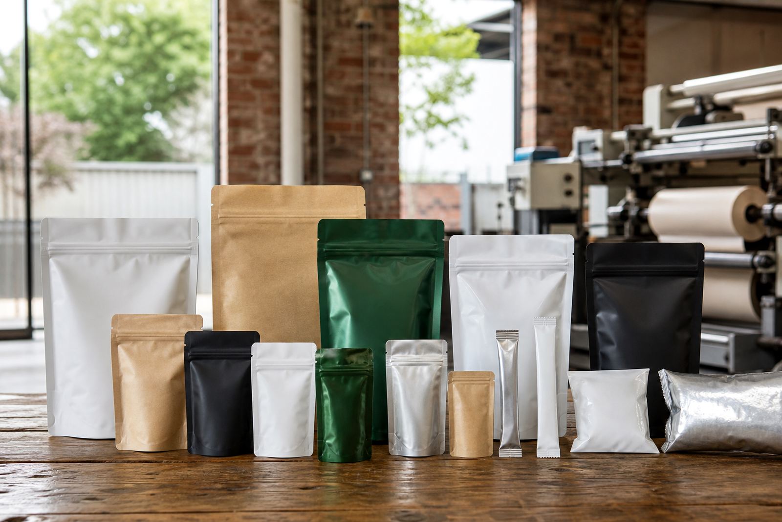
A product family does not need every pack to be a copy of the next one. In fact, forcing the same layout onto every size can make smaller packs hard to read and larger packs feel empty. The better approach is to keep the main brand cues steady while allowing each format to do its job.
That usually means holding the same logo position, colour family, type style and key message across the range. Then the panel layout can shift to suit the pouch, sachet or wrap. A 25 g sachet does not have the same working space as a 1 kg pouch, so the design should flex with the format not fight it.
Start with the elements customers must recognise first
Before artwork gets split across sizes, decide which parts of the pack must stay unchanged. These are the pieces that help a shopper identify the product quickly on a shelf, in a spaza shop counter display or in a trolley full of mixed goods.
- Main brand name and logo placement
- Colour palette and background contrast
- Product name or flavour naming style
- Key image treatment, such as ingredient photography or pattern blocks
- Finish choice, for example matte or gloss areas where used
Once those items are fixed, the rest of the layout can be adjusted for size, legal copy, barcode placement and any pack specific details. That keeps the range connected without making every face look cramped.
Different pack sizes need different visual weight
What looks balanced on a 200 mm pouch may feel heavy on a sachet and too sparse on a wrap. This is where good artwork prep matters. Small packs need bolder type, fewer claims and cleaner spacing. Larger packs can carry more information, but they still need a clear reading path from top to bottom.
For example, a snack range might use a strong colour bar across all sizes. On the sachet it becomes a simple block with the flavour name. On the pouch it can expand into a full band with ingredient imagery and a short product story. The family remains connected, while each pack is scaled properly. That little bit of planning saves a lot of rework later.
- Keep high contrast on small formats
- Use simpler image crops for sachets
- Reserve quieter areas for barcodes and codes
- Leave enough seal and trim allowance on every size
Flexo printing works best when colour is planned across the full range
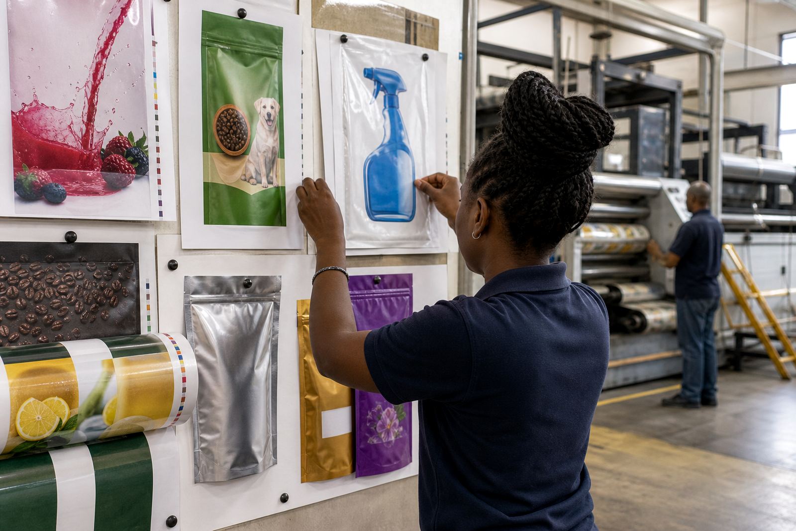
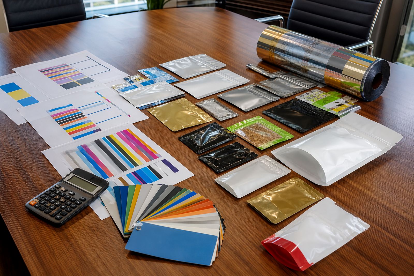
In flexo printing, colour matching across several pack sizes depends on more than one press run. Substrate choice, ink laydown, line screen and even how much ink a surface takes up can change the final look. That is why a matching range should be planned as a set, not as separate jobs done in isolation.
At our Pinetown base, we often see local brands wanting the same red, green or metallic effect across pouches, wraps and sachets. The practical way to handle it is to define the colour target early, then proof it against the material that will actually be used. A colour that reads well on one film may shift on another, especially in coastal humidity where handling and storage conditions can vary. It is worth checking this before the full run, not after the cartons have been packed.
Artwork rules that keep a family design tidy
Matching range designs are easier to manage when the artwork is built with rules. Those rules make production quicker and reduce errors when a product line grows from three sizes to six or more. They also help repeat production stay consistent from one dispatch to the next.
- Set a clear grid for logo, product name and variant label
- Keep fixed margins for seal areas and zip areas where relevant
- Use one style for icons, callouts and warnings
- Limit the number of font weights across the range
- Use the same naming structure for flavours, sizes or variants
When those rules are followed, a new size can be added without redesigning the whole family. That is useful for brands selling across Durban, Johannesburg and Cape Town, where the pack may need to work in different retail settings and still be recognisable at a glance.
A local example from a KZN product line
Consider a Pinetown-based food business supplying three pack formats for the same range: a small sachet for sampling, a mid-size pouch for general retail and a wrap for a bundle pack. If each format is designed separately, the result can look like three different products. If they are planned together, the range feels connected from the first impression to the last.
The sachet might carry a reduced label panel, the pouch can show the full brand story, and the wrap can use a simplified version of the same colour blocks and typography. The result is a family that feels coordinated on shelf and easy to manage during reorders. For local brands moving stock through Pietermaritzburg, Ballito and beyond, that consistency helps customers spot the product quickly even when the pack size changes.
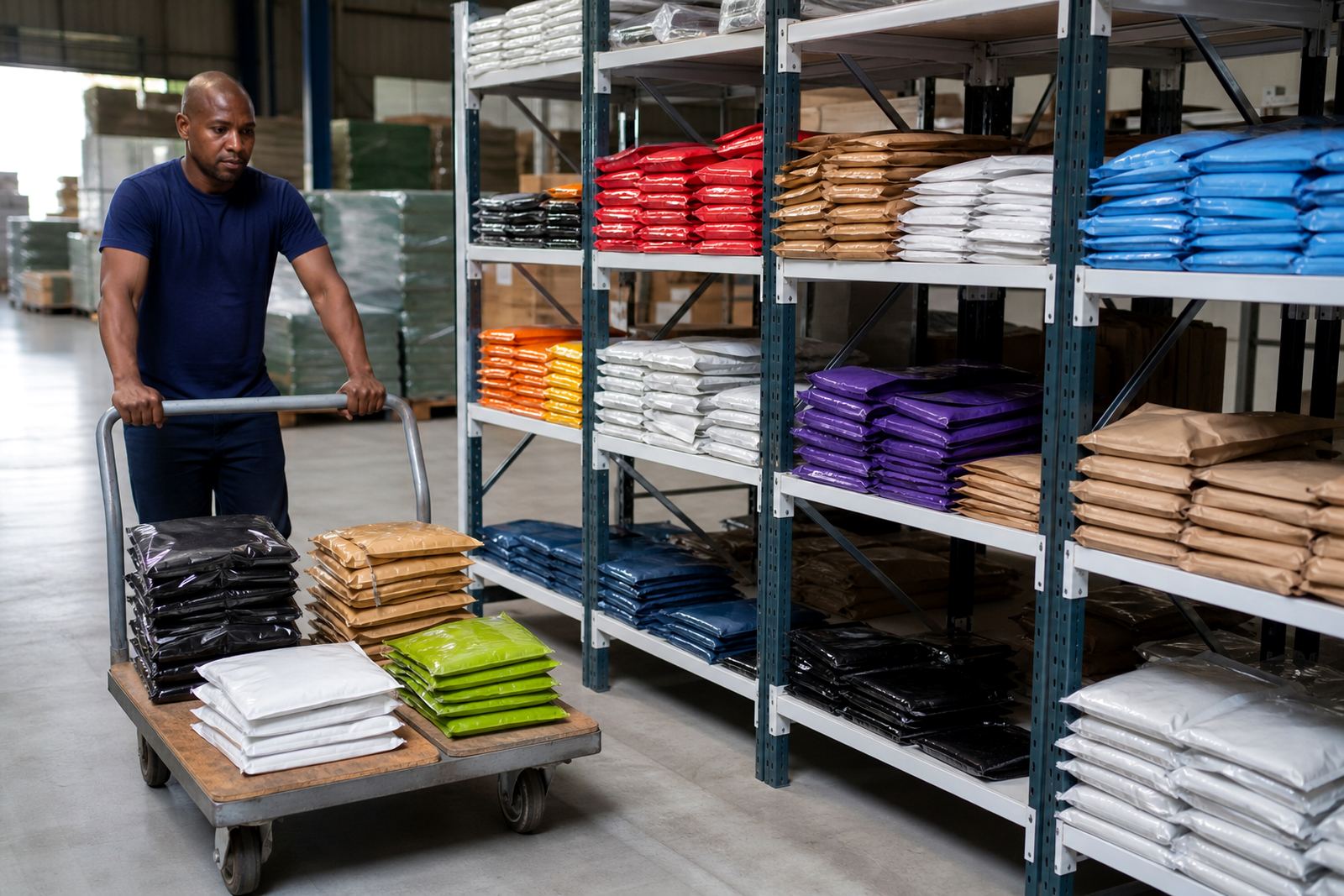
Our team handles artwork prep, print proofing, colour matching, material selection and dispatch coordination from one point, which helps keep the range aligned through production and delivery. Siyabonga Ndlovu oversees the operation with support from Priya Naicker, Marius van Wyk, Thandiwe Mkhize, Jason Petersen and Lerato Molefe.