
Why a transparent panel can do real selling work
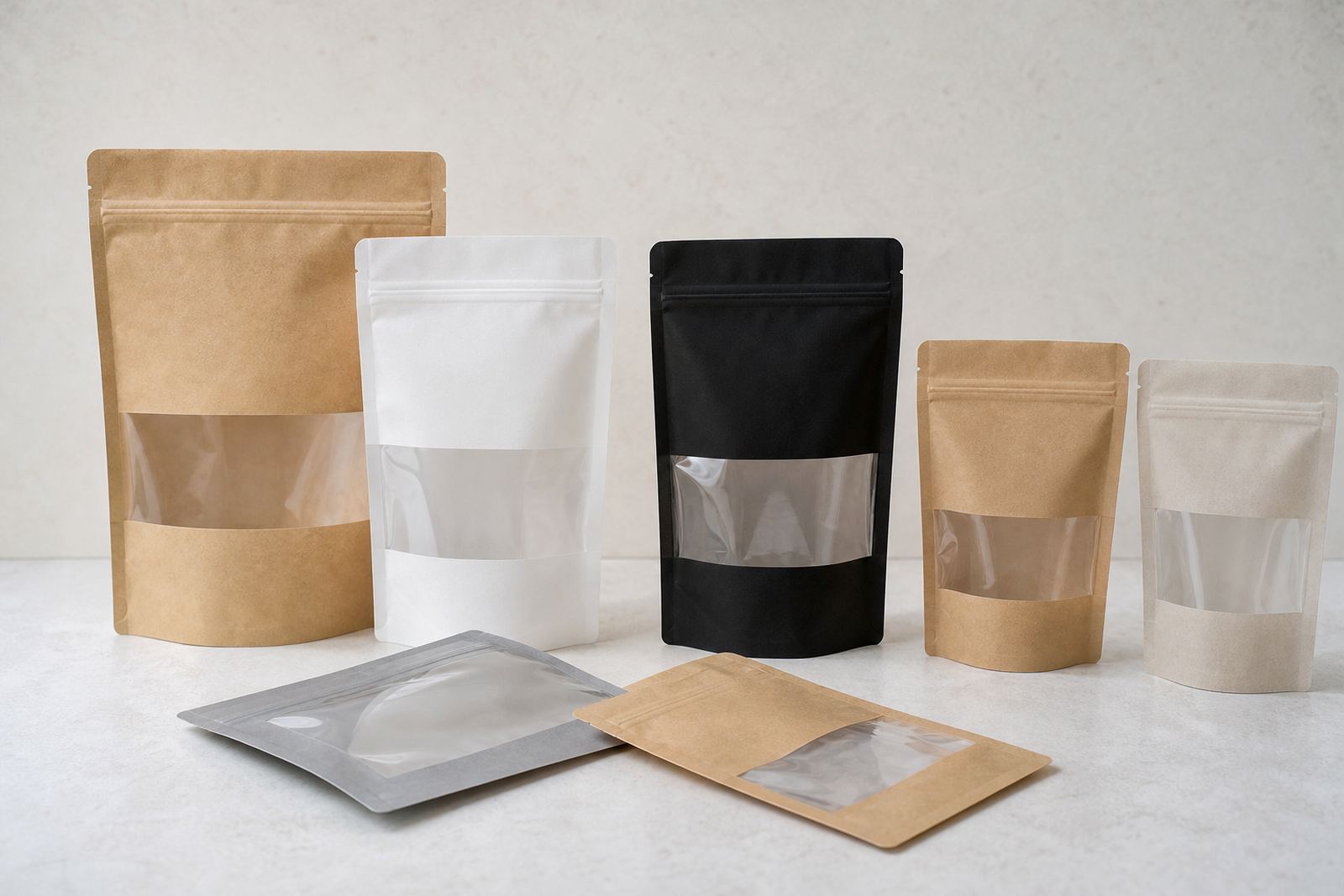
A clear window is useful when the product itself needs to be seen before purchase. People buying grains, snacks, pet treats, dried fruit or hardware items often want a quick check on colour, texture or fill level. A transparent viewing area can answer that question at a glance, which is especially helpful in busy retail environments where the pack has only a few seconds to make its point.
It also helps when a brand wants a natural or practical look without losing print space. The printed areas can still carry the product name, usage notes, batch details and handling instructions, while the window gives shoppers a direct view of what they are getting. Done properly, it feels honest and tidy rather than overdone.
- Best for products where size, colour or texture matters
- Useful when buyers compare several pack types side by side
- Helps smaller ranges look more open and less crowded
Choosing the right format for the viewing area
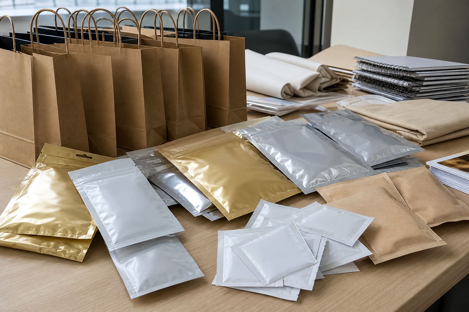
Clear window packs can be built into pouches, sachets and wraps in different ways. A pouch might use a front panel window so the product is visible without giving up too much print area. A sachet may use a narrow strip or shaped cut-out area, while wraps often rely on a clear section placed where the contents will show neatly once packed.
Placement matters. If the window sits too low, the product may settle away from it. If it sits too high, the pack may look empty on shelf. For loose products and granules, the fill point needs careful planning so the contents appear full and balanced. For folded or stacked items, the panel should show the most useful part of the product, not just a random edge.
- Front windows work well when shelf appeal is the main goal
- Lower windows suit heavier contents that settle during transport
- Narrow panels can keep the design stronger on smaller sachets
How flexo printing supports a clean finish
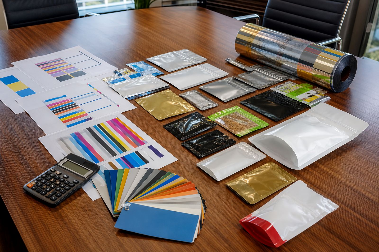
Flexo printing is a strong choice for this kind of packaging because it handles repeat artwork well and gives consistent results across short runs and larger repeat orders. The printed areas around the window need good colour control so the pack still looks finished, even with part of the front left transparent. That balance is important for brands that want a practical pack but not a plain one.
Artwork planning should allow for the see-through section from the start. Text should not crowd the window edge, and logos should sit where they still read clearly if the pack is partly full or partly settled. Colour matching also matters, because strong inks around a clear panel can make the product look more defined, especially for food lines, pet products and retail goods that are packed in varying quantities. In coastal areas like Durban and Pinetown, humidity can also affect storage and dispatch planning, so pack choice and seal integrity should be considered together.
Material selection and what the pack has to handle
Not every pack material behaves the same around a clear panel. Some products need better stiffness so the window sits flat and the printed areas do not wrinkle too easily. Others need a softer structure that seals cleanly and still stays easy to handle on the line. The right choice depends on the product weight, shelf life target and how the pack will move through filling, sealing and dispatch.
For local brands, it is worth thinking beyond the shelf. Will the packs travel from Pinetown to Johannesburg in winter, or sit in a hot storeroom in Bloemfontein before reaching the shop floor? Will they be stacked tightly, or displayed hanging on hooks? These practical questions affect how the window performs. They also influence whether the design should keep the clear area modest or make it a central feature.
- Consider stiffness if the pack must stand upright
- Check seal strength for products that travel long distances
- Match the window size to the fill weight and product shape
Artwork choices that keep the pack looking balanced
Clear window packs work best when the artwork gives the eye a clear route. Strong type, simple product naming and a neat block for the transparent panel usually work better than busy graphics. If the design is overcrowded, the window can make the front feel unfinished. If the layout is calm, the viewing area becomes part of the design and not a gap in it.
A useful approach is to decide what the shopper should see first, then build the artwork around that. For example, a snack pack may need the window to show the product texture, while the top section carries the range name and pack size. On a sachet, the panel may be small but still enough to confirm colour or granule size. On a wrap, the clear section can help show the wrapped item without hiding the branding. It is a small detail, yet it changes how the whole pack reads on shelf.
- Keep key text away from the window edge
- Use the transparent area to show product quality, not clutter
- Leave room for practical information and handling marks
A local example from Pinetown to the rest of the country
A Pinetown-based brand supplying retailers in Durban and Gauteng may want a pack that feels practical on the shop floor but still holds its own among more colourful ranges. A clear window can help with that. For a dry goods line, the viewing area can show fill level and product consistency, while the printed areas carry the brand name, usage notes and batch details in a tidy layout. That kind of pack is easier to manage across repeat production too, because the same artwork can be used across branches and delivery routes with small controlled adjustments if needed.
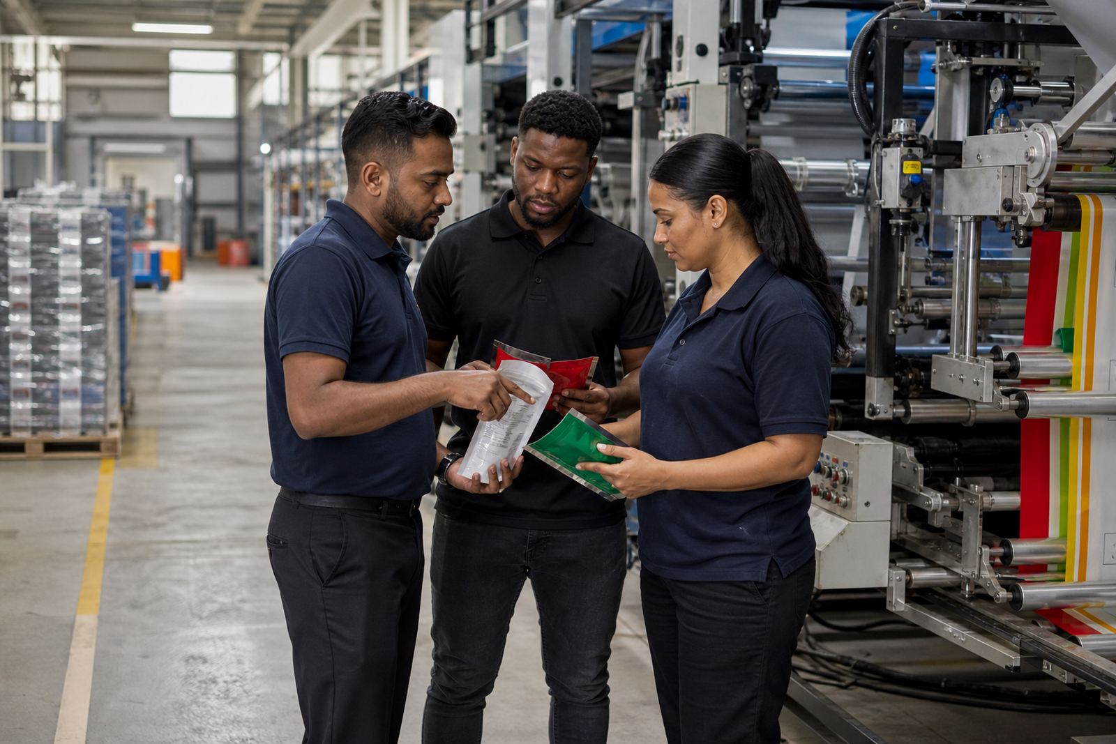
At Flexography Printing Co, the process usually starts with packaging advice, artwork prep and print proofing, then moves into flexo printing, pouch converting or sachet production depending on the format. Dispatch coordination matters just as much, because a neat pack still has to arrive on time in Cape Town, Pretoria or Bloemfontein. Clear window packs are not about showing everything. They are about showing just enough, in the right place, so the product feels easy to trust and simple to buy.