
Project brief from Newlands East
The brief came from a pet product business in Newlands East, KwaZulu-Natal, looking to move away from smaller packs that were getting lost on shelf. The team wanted pouches that made the brand easier to read, gave more room for product information and still packed neatly for warehousing and delivery.
The range needed to suit local retail, independent pet shops and wholesale orders. The ask was practical: improve shelf presence, keep the pack easy to stack, and make sure the packaging held up during transport in warm inland conditions and humid coastal air. We also had to keep the print setup workable for repeat orders, since stock levels change quickly in this category.
What changed in the pouch format
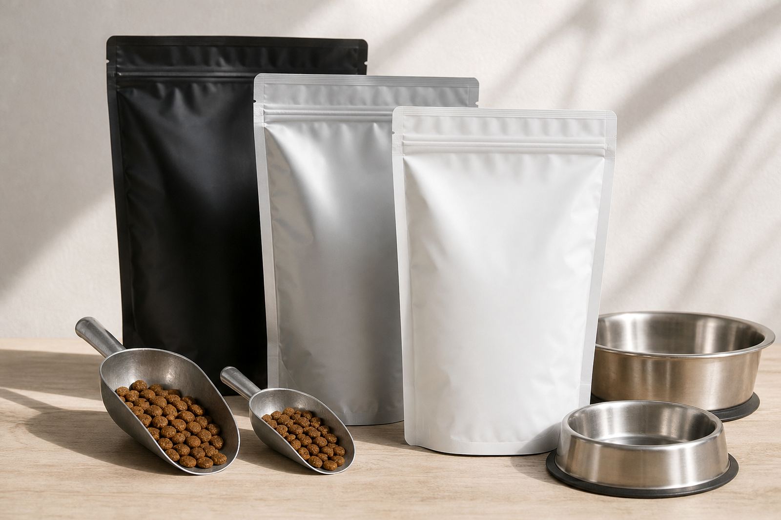
The move to larger pouches gave the brand more space for front panel branding and clearer product details. It also improved how the packs sat on shelf and in cartons, which matters when a store is tight on space and staff need to face up stock fast.
- Larger pouch face for stronger branding and clearer product naming
- Improved storage shape for shelf stacking and carton packing
- Space for feeding notes, weights and usage detail without crowding the artwork
- Practical closure and seal layout for handling during dispatch and resale
We kept the format suitable for flexo printing so the artwork stayed crisp across the run, with repeatable results from batch to batch. The finish needed to look tidy on the shelf and still work well in real-world handling, not just in a mockup on a screen.
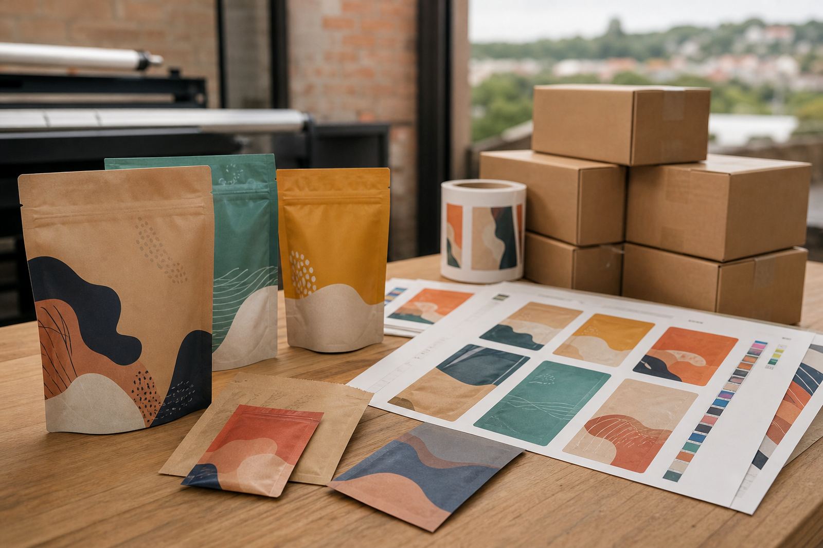
Press setup, artwork prep and colour matching
Once the pouch size was agreed, we handled artwork prep, print proofing and colour matching to keep the branding consistent across the new format. With pet products, even a small colour shift can change how the pack reads on shelf, so we paid close attention to brand tones and text clarity.
We also reviewed the material choice against the product and the route to market. The pack had to handle repeated handling, short-term storage and transport across Durban, Johannesburg and other delivery points without scuffing up too quickly. The goal was a clean finish with practical durability, not overworked packaging that adds cost without helping the product.
For this job, the prepress stage was just as important as the print run. Text that is too close to the edge or too small can disappear on a flexible pack, so we adjusted spacing and panel balance before production. That saved time later and reduced avoidable back-and-forth.
Production in a six-week window
The project ran over a six-week period from artwork refinement to dispatch coordination. That included brief confirmation, proofing, pouch converting, flexo printing and packing for collection and delivery. The schedule gave enough time to make changes properly without dragging the job out.
- Week 1 to 2: brief review, artwork checks and size confirmation
- Week 3: print proofing and colour adjustment
- Week 4 to 5: pouch production and finishing
- Week 6: final inspection, carton packing and dispatch planning
Because load-shedding and production interruptions can affect many sites in South Africa, we kept the workflow organised around key press and finishing steps. That helped protect the timeline and kept the order moving without confusion. The client could plan stock release with a bit more confidence.
Results on shelf and in storage
The larger pouches gave the range a better shelf face and made the product easier to identify from a few steps away. In store, that matters. Buyers can see the name, size and key message more quickly, and staff can face up the packs with less effort.
Storage also improved. The new format stacked more neatly in cartons and on pallets, which helped with dispatch and backroom handling. The client wanted something that looked better but still behaved like a working pack, and that balance came through clearly. There was also less crowding around the label areas, so the information read more cleanly and the branding had room to breathe, without looking overdone.
For a pet product line, repeat orders are common and range changes happen often. The better the pack performs in the warehouse and on shelf, the easier it is to keep stock flowing. That is where practical packaging makes a real difference.
What we would do again for a similar pet range
If we were doing a similar job again for a pet product brand in Newlands East or elsewhere in KwaZulu-Natal, we would start with the shelf test before final artwork sign-off. Seeing the size and structure in context makes it easier to judge whether the branding needs more contrast, larger type or a different panel layout.
We would also keep the repeat-production notes from the start. That includes the pouch size, colour targets, carton packing method and dispatch plan. Small details like that save time later, especially when the next order has to move quickly.
- Confirm the shelf view before final artwork approval
- Lock down pouch dimensions and carton counts early
- Keep print targets consistent for repeat runs
- Plan dispatch around the client’s delivery route and storage space
That approach suits brands that need packaging to do more than look good. It needs to print well, pack well and hold up in day-to-day use, which is exactly what this project called for.
Key facts
| Client type | Pet product business |
|---|---|
| Location | Newlands East, KwaZulu-Natal |
| Format | Larger flexo-printed flexible pouches |
| Scope | Artwork prep, print proofing, colour matching, pouch converting and dispatch coordination |
| Timeline | 6 weeks |
| Delivery | Pinetown base with delivery across South Africa, including Durban, Johannesburg, Pretoria, Cape Town and Bloemfontein |