Project brief from a Durban snack producer
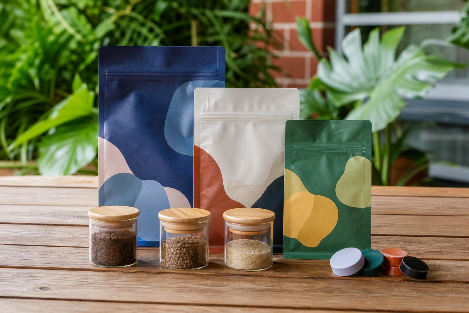
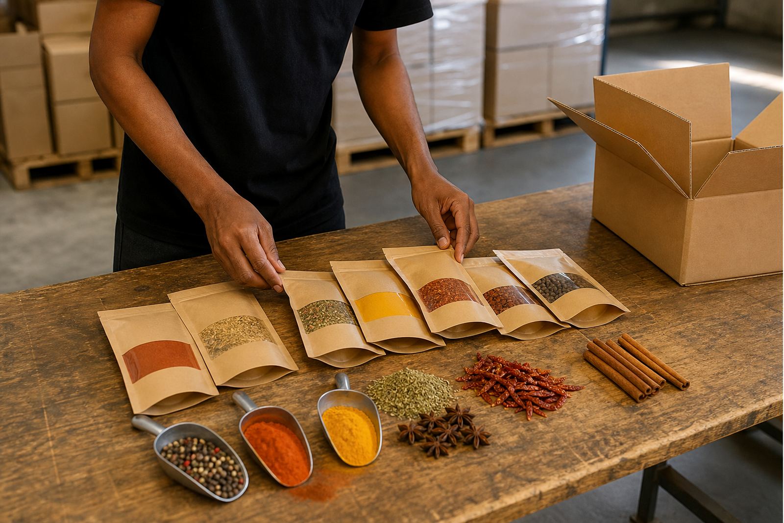
The brief was simple, but the details mattered. A snack brand based in Durban wanted to move from a plain, low-impact pouch to a brighter stand-up pouch that would read better on shelf, carry clearer product information and still suit repeat production. The team needed something practical for local retail, with packaging that could handle handling in stores, in transit and in humid KwaZulu-Natal conditions.
We started by looking at the pack size, the filling method and the shelf position the product would sit in. Because the snack was sold through multiple outlets, the packaging had to look consistent from batch to batch and hold its shape well once filled. The client also wanted the format to work across Durban distribution, with deliveries later going to Johannesburg, Pretoria, Cape Town and Bloemfontein as orders grew.
What shaped the packaging decision
For a snack product, the pouch has to do more than carry print. It needs to seal properly, stack neatly and present the brand clearly from the front. We discussed material selection, closure style and the panel layout so the artwork had enough space for product naming, ingredients, pack size and handling notes. The idea was to improve the front-of-pack impact without making the pack awkward for packing lines or store shelves.
The customer also had a few constraints. The product needed a stable base for display, a finish that would hold colour well and a layout that could be updated for repeat orders without a full redesign each time. We kept the structure straightforward so production stayed manageable and the finished pouches could move through the line without hassle. That mattered because in packaging, small changes can slow things down more than people expect.
- Format selected: stand-up pouch
- Use case: snack retail and store display
- Print approach: flexo printing for repeatable production
- Finish: brighter shelf-facing artwork with clear product panels
- Operational focus: practical filling, sealing and dispatch
Artwork prep, colour matching and proofing
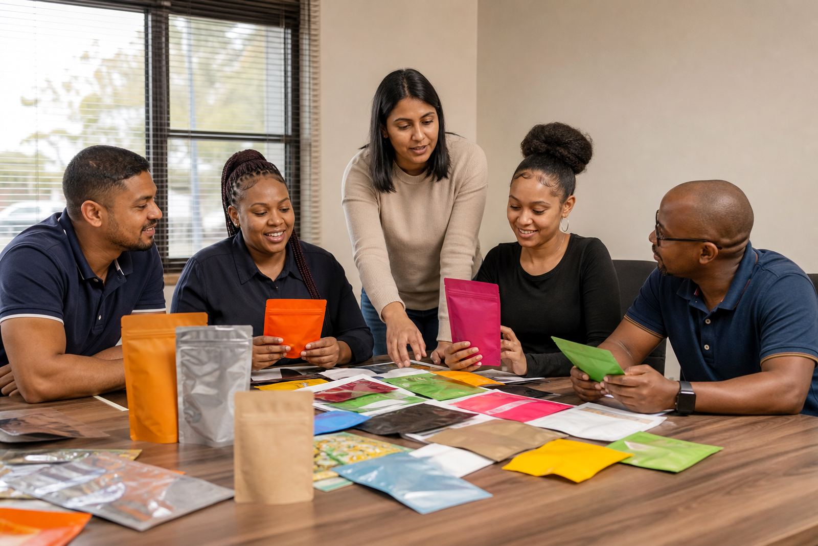
Once the format was confirmed, we moved into artwork prep and proofing. The client wanted stronger shelf presentation, so colour balance was important. Brighter print can look good in a mock-up and then go flat on the press if it is not checked carefully, so we worked through colour matching with attention to the brand tones, the background shade and the text contrast. That way the pouch stayed legible and the product name stood out from a distance.
We also checked the panel flow so the key information sat in the right places. Small packaging changes can affect where text lands once the pouch is formed and sealed, especially on a stand-up pack. We adjusted the layout to suit the converting process and made sure the artwork would still read clearly after filling. The prepress stage kept the line work clean, and the proofing round gave the client a proper view of what would be produced.
- Artwork aligned to the pouch structure and seal areas
- Colour matched for a brighter front panel
- Proofs reviewed before production started
- Text placement checked for legibility after filling
Production details for the pouch run
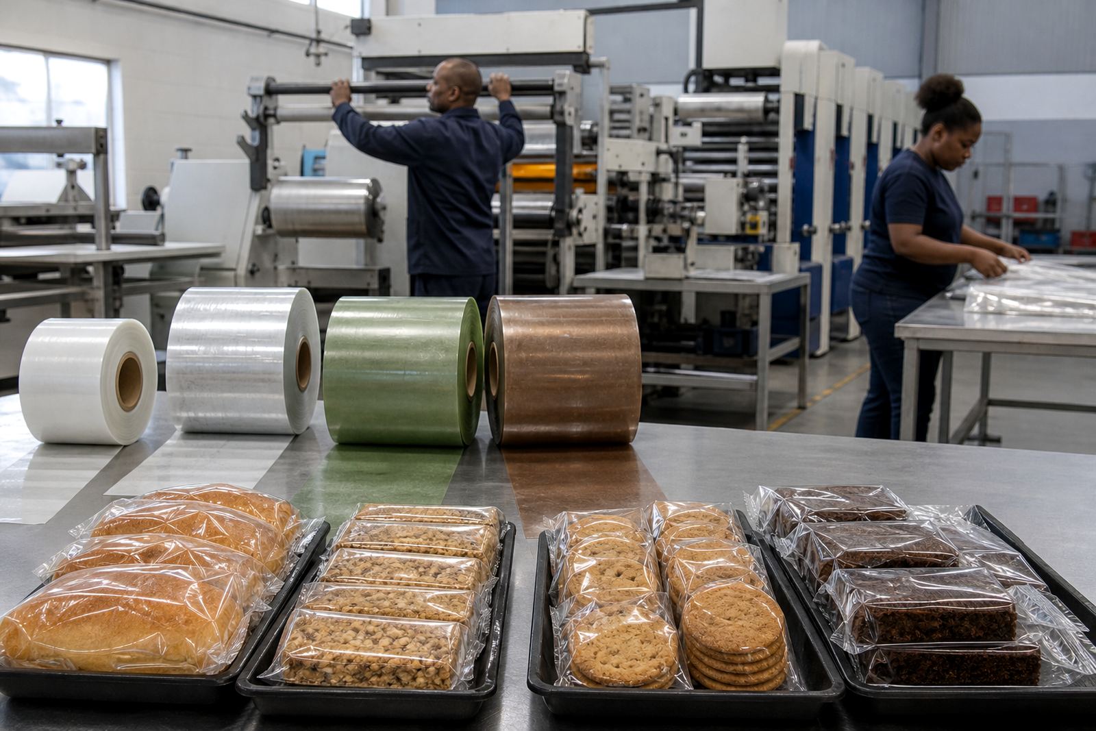
The production run was set up as a practical, repeatable order rather than a one-off showpiece. Flexo printing suited the volume and gave the client a consistent result across the run. We then handled pouch converting so the packs formed correctly and held their shape. Because the snacks were to be distributed across different areas, we kept the dispatch plan tight and labelled the pallets for easier sorting on arrival.
The work included print proofing, colour control, pouch converting and dispatch coordination. We also looked at repeat order planning so the client could come back with the same specification for future batches. That helps when a Durban brand is selling through more than one channel, as consistency is often what keeps the shelf presentation neat from store to store. The final result was a brighter pack that looked more confident without complicating the production setup.
Timeline was approximately 3 weeks from brief sign-off to dispatch, with the proofing and production stages run in sequence. That pace worked well for the customer because it allowed time for review without holding stock back too long.
How the new pack performed on shelf
The biggest change was visibility. The brighter stand-up pouch gave the snack range a cleaner shelf presence and made the product easier to spot among competing packs. The client also had better consistency from batch to batch, which helped with repeat orders and store rollouts. In practical terms, the packaging now supported the product instead of fighting for attention.
We did not overcomplicate the solution. The pack still had to be easy to fill, seal and store, and it had to suit local conditions like warm warehouse space and coastal humidity. In KwaZulu-Natal, packaging that looks good on paper but shifts in storage can cause problems later, so the material and print approach were chosen with that in mind. The result held up well through handling and transport, and the customer could move ahead with a more presentable retail pack.
- Stronger shelf visibility for a snack range
- More consistent presentation across repeat runs
- Practical for packing, storage and transport
- Suitable for Durban conditions and wider South African distribution
What we would repeat on the next run
If we were doing this job again, we would follow the same process: confirm the filling method, lock the pouch size early, and proof the artwork with the final colour intent in mind. That keeps surprises out of production and helps the finished pack match the brand goal. We would also keep the dispatch planning close to the production schedule so the client can receive stock in a tidy sequence for different regions.
For snack brands, the lesson is usually the same. A good pouch should not only look brighter, it should work in the hands of the packer and the store buyer too. This Durban project showed that a better shelf pack can be achieved without fuss, as long as the structure, print and timing are handled properly. The client got a cleaner presentation and a format they could use again for future production. It was a straightforward job, but an important one.
Key facts
| Client type | Snack producer |
|---|---|
| Town | Durban, KwaZulu-Natal |
| Project format | Stand-up pouch |
| Print method | Flexo printing |
| Timeline | About 3 weeks from brief sign-off to dispatch |
| Scope | Artwork prep, colour matching, pouch converting and delivery coordination |